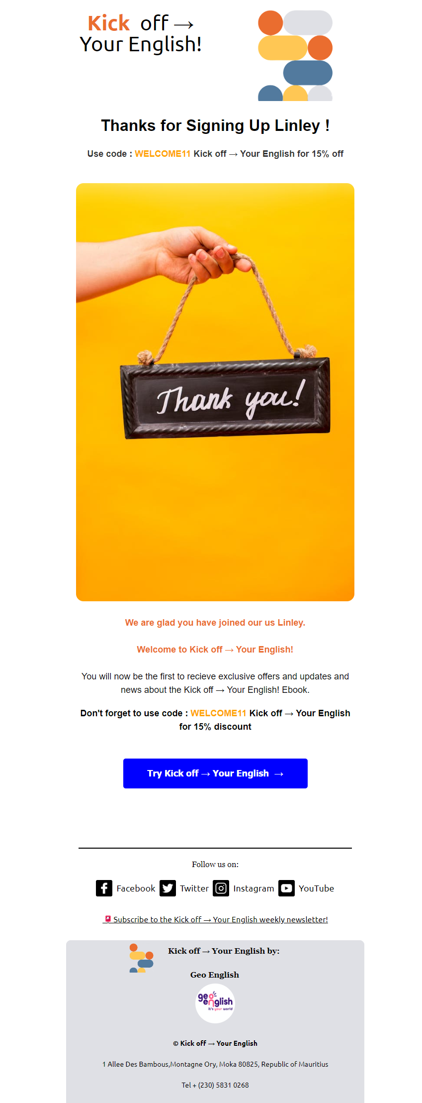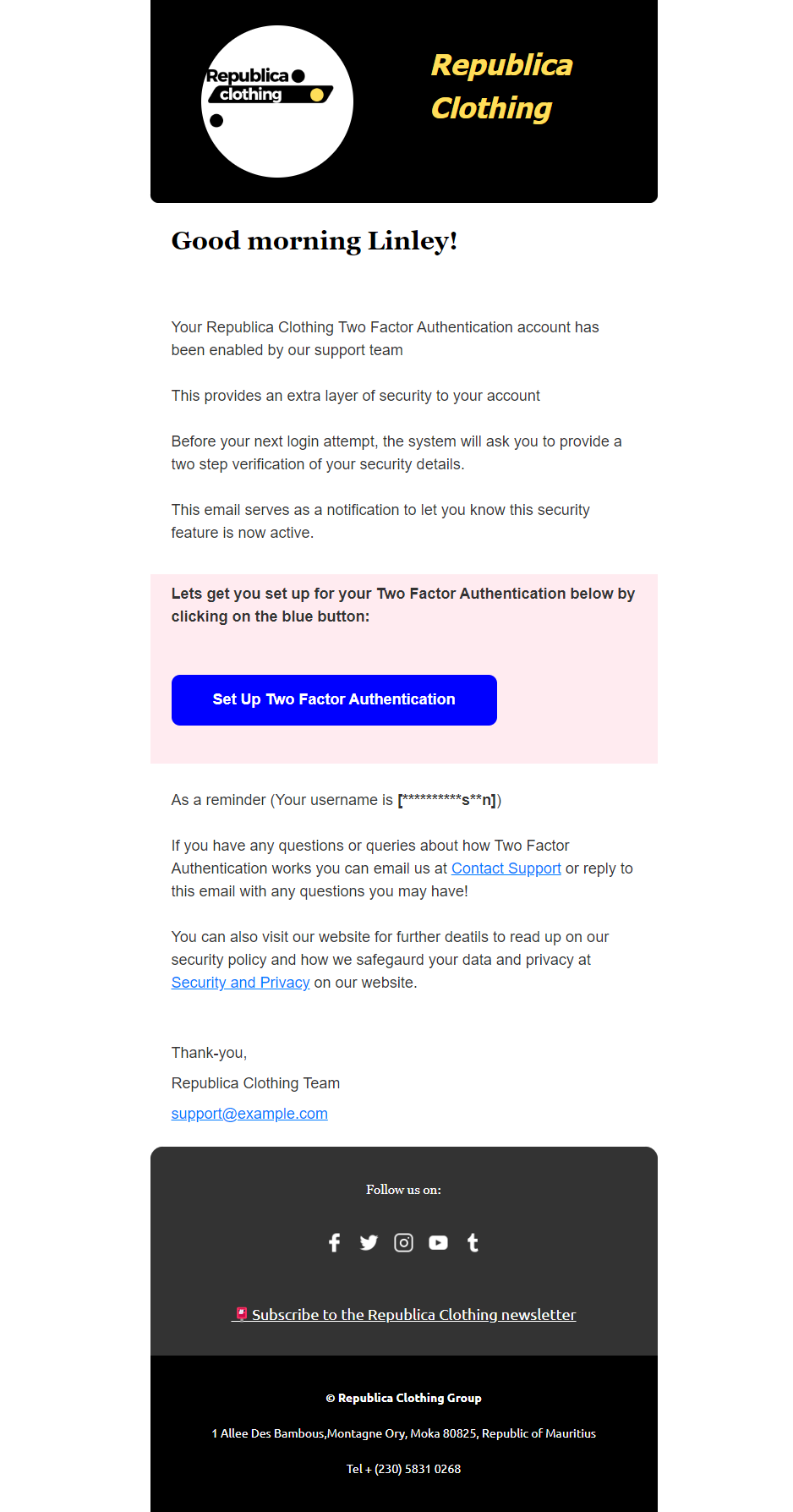
UI-User Interface/UX-User Experience: The Relation To Responsive Email Development.

The fundamental UX design principles include visual and information architecture, simplicity and usability, user-centricity, typography, accessibility, consistency, context, user control, and user testing. Please explain each one in terms of email design.

Here I will explain step by step how Responsive and Hybrid design correlate to fundamental UX design principles in the context of email design: But firstly let me explain UX (user experience) design first:

Visual and Information Architecture Email Design: Organize content in a clear, logical structure. Use headers, subheaders, and sections to guide the reader through the email. Ensure important information is prominently placed, often above the fold, to capture attention immediately.

Simplicity and Usability Email Design: Keep the design clean and clutter-free. Focus on a single primary message or call-to-action (CTA). Avoid overwhelming the reader with too much information or too many choices. Simple layouts with ample white space enhance readability and user engagement.

User-Centricity Email Design: Design emails with the user’s needs and preferences. Personalize content based on user behaviour, demographics, or past interactions. Ensure the email provides value to the recipient, whether it’s through relevant offers, helpful information, or engaging content.

Typography Email Design: Use clear, legible fonts that are easily read on all devices. Ensure a good contrast between text and background. Use different font sizes and weights to create a visual hierarchy and guide the reader’s attention to key points and CTAs.

Accessibility Email Design: Make emails accessible to all users, including those with disabilities. Use semantic HTML and ARIA landmarks. Ensure colour contrast meets accessibility standards. Provide alt text for images and use accessible fonts. Test emails with screen readers to ensure all users can access the content.

Consistency Email Design: Maintain a consistent design across all emails and align with the brand’s overall visual identity. Consistent use of colours, fonts, and design elements helps build brand recognition and makes emails feel familiar and trustworthy to recipients.

Context Email Design: Consider the context in which the email will be read. Design for various devices and screen sizes, ensuring responsive design. Tailor content to the recipient’s current situation or past interactions with your brand to make the email more relevant and engaging.

User Control Email Design: Allow users to have control over their email preferences. Provide options to manage subscription settings, such as the frequency of emails and types of content they receive. Ensure an easy and visible way to unsubscribe if they wish.

User Testing Email Design: Test emails with real users before sending them to the entire list. Use A/B testing to determine which design elements, subject lines, or CTAs perform best. Collect feedback and iterate on your designs to continuously improve the user experience.

By incorporating these UX principles into your email design, you can create more effective and engaging emails that resonate with your audience and drive better results.

Now let’s look at how UX relates to responsive design.

Here it provides a more tailored experience for viewers, taking for example buttons, font sizes, and content that is placed ideally where it is easier to read on smaller screens. You can make things scalable making it somewhat future-proof because it is equipped to adapt to a whole host of current and future devices and or technologies with different screen sizes.

While we need to consider that responsive email is more complex to develop, it makes it easier with email frameworks like MJML (MailJet Markup Language) and others like HEML, Maizzle, and Cerberus. Overall, responsive email design and development has good performance even on older email clients’ rendering engines that ensure a functional layout that works well. Fluid layouts use percentages and media queries and take less time and testing in my view.

So the question is, which one is better? Well, it depends, so no one is better than the other. It depends on the solution you are trying to provide. If you want a modern, customized email design, I feel the responsive design is the way to go and provides a better UX (user experience) on all modern devices, mobile, desktop, and tablets. However, as I have said before, it requires more complex coding and a lot of testing, so complexity equals more testing and other technical aspects.

If you want a broad solution and good compatibility and simplicity, a hybrid email design is better in my opinion since this will be used in a straightforward solution that is functional and useful with most email clients. Again, it depends on the use case.

Let’s come to the layout, will it be single-column or multi-column layouts? Single-column layouts fit on any device since they fit all information in one column reading in a line from top to bottom sequence by sequence. Single-column layouts are more responsive, so they are compatible with all devices. You do not have to restyle the template to re-adjust to the varying screen sizes. In terms of UX (user experience), it is practical and easy, and the user can see the information displayed in an inflowing manner, right?

However, as an Email developer, I found that I have to be extra creative with my design and with images, colours, typographies, and fonts since it may look too simple or bland, to be honest. In addition, single-column layouts work though, keep things simple with layouts, but you may have to work more on the colour and typographies, white space, and GIFs to add that extra interactivity.

Multi-columns, on the other hand, are great since you can logically fit more information and content, presenting more, is more visually appealing sometimes, but be careful here not to distract the email viewer. With multi-columns, you can place a few clickable links and CTAs (Call To Action) if you want or are required.

The only problem here is with coding them responsively, these types of designs require more coding complexity and problem-solving. While this is not new, more attention to detail is required to make it accessible, functional, usable, and practical.

UI (User Interface) in the Context of Email Design:

Visual and Information Architecture (UI): Ensure a visually appealing layout that aligns with your brand’s aesthetics. Use colour schemes, images, and icons that enhance the readability and visual hierarchy, making it easy for users to navigate and interact with the email content.

Simplicity and Usability (UI): Design intuitive and straightforward interfaces. Buttons and links should be easily identifiable and clickable. Use recognizable icons and simple navigation structures to enhance user interaction.

User-Centricity (UI): Create a visually engaging interface that resonates with your audience. Use personalized visuals, such as user-specific images or dynamic content blocks, to make the email feel more tailored to individual recipients.

Typography (UI): Choose fonts that are visually appealing and on-brand. Use typography to create contrast and emphasis, making important information stand out. Ensure that the chosen fonts render well across different email clients.

Accessibility (UI): Design interfaces that are easy to use for everyone. Use accessible colour schemes, and scalable text, and ensure that interactive elements like buttons are large enough to be easily clicked, even by users with limited dexterity.

Consistency (UI): Maintain a consistent visual style across all emails. This includes using the same colour palette, typography, and layout patterns. Consistency helps reinforce brand identity and provides a seamless user experience.

Context (UI): Adapt the UI to fit the context in which the email is being read. Ensure that the design is responsive and adjusts to different screen sizes and orientations, providing a seamless experience whether the email is viewed on a smartphone, tablet, or desktop.

User Control (UI): Design interfaces that allow users to easily manage their preferences. Use clear and visually distinct buttons or links for actions such as unsubscribing or adjusting email settings.

User Testing (UI): Conduct visual tests to ensure that the email design looks good across different devices and email clients. Gather feedback on the visual aspects of the email to identify any areas that need improvement.

By considering both UX and UI principles, you can create emails that are not only functional and user-friendly but also visually appealing and engaging, providing a holistic and satisfying user experience.

Factors in Design and Development of Emails What You Need TO Know Part 2.

Email development does not have to be hard, and if you follow some simple rules for coding and designing it will help immensely. Here I will discuss some of the common design and development considerations and how they can assist you in delivering email marketing campaigns at a good standard.As an Email Developer, I want to share more on what has to be considered an important part of designing, developing and coding these emails.

Design Perspective

Let’s start from a design perspective. Email design is crucial here, both in terms of form and planning it is crucial for communicating an engaging email that is aesthetically pleasing and is effective in capturing people’s attention. Remember one thing, emails are entirely read by most people; rather, they scan or skim information, scanning for what is relevant and skimming to more important details they believe they want to know more!

Layout and UX Fundamentals

Now consider the layout. Is it user-friendly and does it follow all the design principles that make the information flow smoothly from one idea to another? In this case, proper utilization of UX – user experience design fundamentals are important, namely information architecture, simplicity, usability, user-centric design, typography, accessibility, consistency of design and brand consistency in the case of email marketing development and context, user control, and last but not least, user testing.

I will not go into detail here in this article about UX email design; however, I will explain more about these aspects in another article post as there is a lot to share and consider, but you get my point.

Clarity and Legibility

Email designs have to be clear, concise, and visible, which means it has to be legible and understood easily in both text and visuals with readable content that needs to engage the audience with a solution to a problem they are trying to solve, and you need to communicate that solution to them easily.

Emails have to have readable fonts for your viewers as they will assess their email on maybe smaller devices sometimes. The fonts need to align with the screen size and be readable and stick with the message you want to convey and the brand identity.

Line Spacing

Line spacing is another important factor here since it allows text and images to “breathe,” and making text, for example, not clustered too close together is never a good thing. This aids in making the design more “special” and assists the viewer to read or scan or skim the email without it being cramped. Again, a logical flow of information that follows some sort of pattern or order, you want to guide the reader into a flow of information.

Text Copy

When writing text copy, try to keep sentences short and to the point, short and sweet! In a world where there are many distractions and where your email will be read in seconds or a very, very short time, you have to be to the point. You are competing for people’s attention and all other message and communication apps whether that be online videos, other applications or software, social media, and life in general. Remember to be short and to the point about your products or promotions, services, or messages.

Whitespace

Whitespace is another important design aspect. Keep in mind the whole space or area around the design. As I mentioned previously, let your design breathe; this will be easier for the viewer.

Information Hierarchy

Another aspect is information hierarchy. This means placing your most important information or content at the top part of your email design. Important content always comes first and the rest of the information in the email will come down in order of priority, so decide which information is important to convey or say first.

Use of Colours and Fonts

Next up is the use of colours and fonts. This is crucial here since we are dealing with both colour psychology and your branding with visual aesthetics. Here you are also dealing with the perception of your brand. Firstly, you should always use a consistent brand colour for your email marketing campaigns that are in line with your brand or company’s colour schemes. They can be the same or a variation of it. This helps with brand recognition and brand association.

Your colour usage needs to be accessible to all people. By that, I mean people with eyesight impairments, problems or disabilities, or are even colour-blind to some extent. Choosing colours that balance your brand and accessibility is highly important, so factor that in as well.

Contrasting Backgrounds and Foreground Colours

Email design has to have contrasting backgrounds and foreground colours. Anything visual is true for all design, so choose your colours wisely since the perception of your email in the inbox is going to have an impact largely because people have a psychological relationship with colours and how they contrast or complement each other is quite important.

Text and Background Colour

Again, in regards to text, background and foreground colour is essential. While using colours, the text copy should be a colour that is easily visible against a background colour. Do not use colours that do not match well, basically ones that have a low visibility or contrast ratio. When trying to read them, it’s going to be difficult for the viewer to read the text.

Simplicity of Visual Elements

Now we look at keeping your visual elements as simple as possible. Do not overload your viewer with too much information or clutter the screen with so many choices. Keep the design as simple as you can. You don’t want to distract them; you want your visual elements to guide their eyes to follow the information and content and ultimately to a call to action.

Images and Media

Try to keep your images, photos, illustrations, and GIFs appealing and interesting about the overall message of your email communication. Do not put too many GIFs, illustrations, and pictures in your email design. Your design needs to be visually pleasing, yes! However, do not overdo it.

CTA Buttons

This leads me to the CTA button – the call to action button. You need to tell the viewers what action you want them to do or at least guide them to that. What action do you want them to take? Is it to sign up for a newsletter, get a discount, purchase a product that’s on offer, download a free ebook, or enquire about the product you are showcasing? You can decide what they will do or what you want them to do, but what’s important here is to mark or place on your email design CTA and put it in a strategic position with preferably adequate white space surrounding your CTA.

Multiple CTAs

You can also have more than one CTA button, 2, 3, or 4 buttons if it’s appropriate to do so, so that your viewers have every chance to click on the button as they read through your email. This makes it easier for them as they read; there is always some button they can click on nearby. Make it easy for them to take some sort of action.

Button Colour Choice

Again here, button colour choice is going to be important. Consider the colour of the actual button and its text colour and text wording. Of course, it has to correspond to your brand to grab the attention of those reading their email inbox.

Mobile Design

One more is designing for mobile devices or smaller devices in mind since they have become more and more popular over the years. Emails will be viewed on smaller devices, so this needs to be factored in. When viewers look at your email, it needs to be 100 per cent visible and legible. Here, from a design and development viewpoint, it will have to be more responsive or developed using what is called a hybrid design approach.

Responsive Email Design

Let me break this down a bit and explain. Responsive email design just means using media queries to adjust the overall layout based on the available screen size of a given device. This gives optimal viewing on any device. The email design looks good on all screen sizes, and this is done by rearranging the layout but changing the structure. It fits and adapts the design but does not change the structure of the email.

Media Queries and Breakpoints

Media queries are a feature in CSS that allows you to apply different styles to a webpage (or an email) based on the characteristics of the device displaying it. This includes factors like screen size, resolution, and orientation (portrait or landscape). They help create responsive designs that look good on both large screens (like desktops) and small screens (like smartphones). For example, you can use media queries to change the font size or layout of a webpage when it is viewed on a mobile device compared to when it is viewed on a desktop computer.

Breakpoints are specific points defined in your CSS where the layout and design of a webpage or email will change to better fit different screen sizes. They are used in conjunction with media queries to create responsive designs. For example, you might set a breakpoint at 600 pixels wide, so that any screen width below this point shows a mobile-friendly layout, and any width above it shows a desktop-friendly layout.

Hybrid Email Design

On the other hand, hybrid email design puts together what they call fluid layouts with the addition of media queries to make the email readable and function correctly with email clients that do not support media queries. It has more consistent support across email clients, even those with limited support for media queries.

Development and Coding Perspective

From a development and coding perspective as an email developer, it may sometimes be easier to write up code when compared to responsive email coding given the fact that it relies on fluid layout techniques and percentages to control the behaviour of the sections and columns rather than breakpoints.