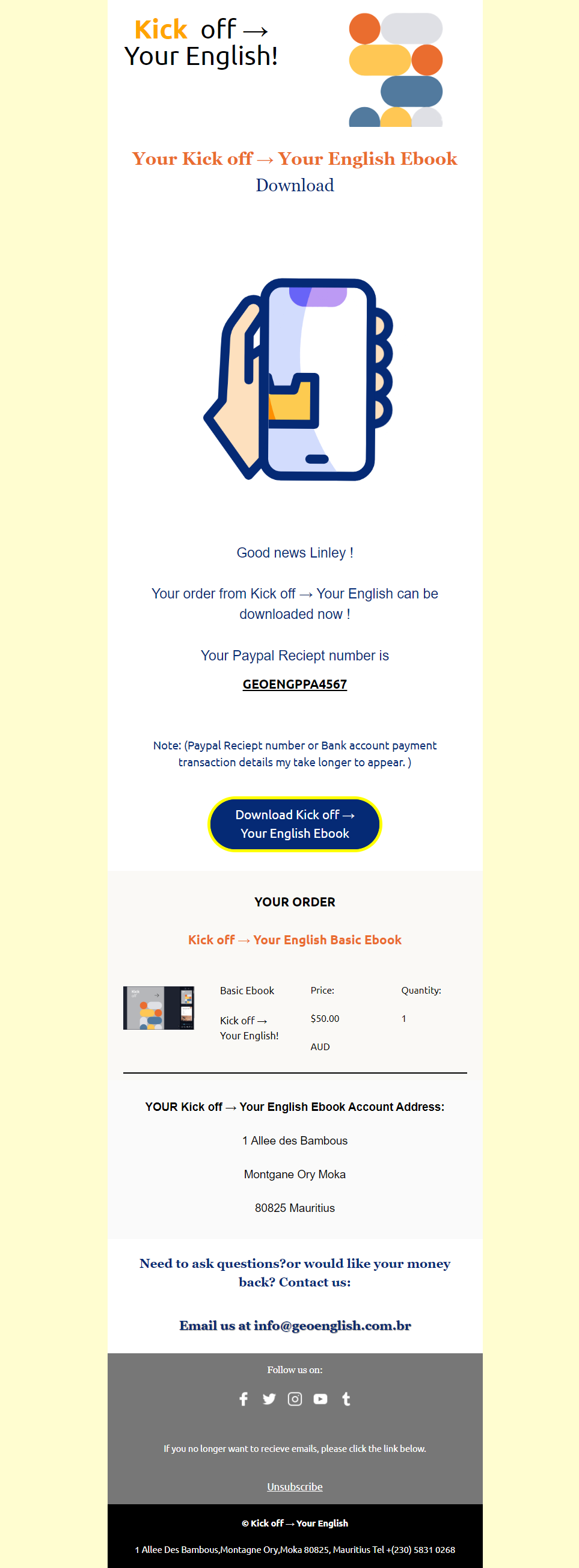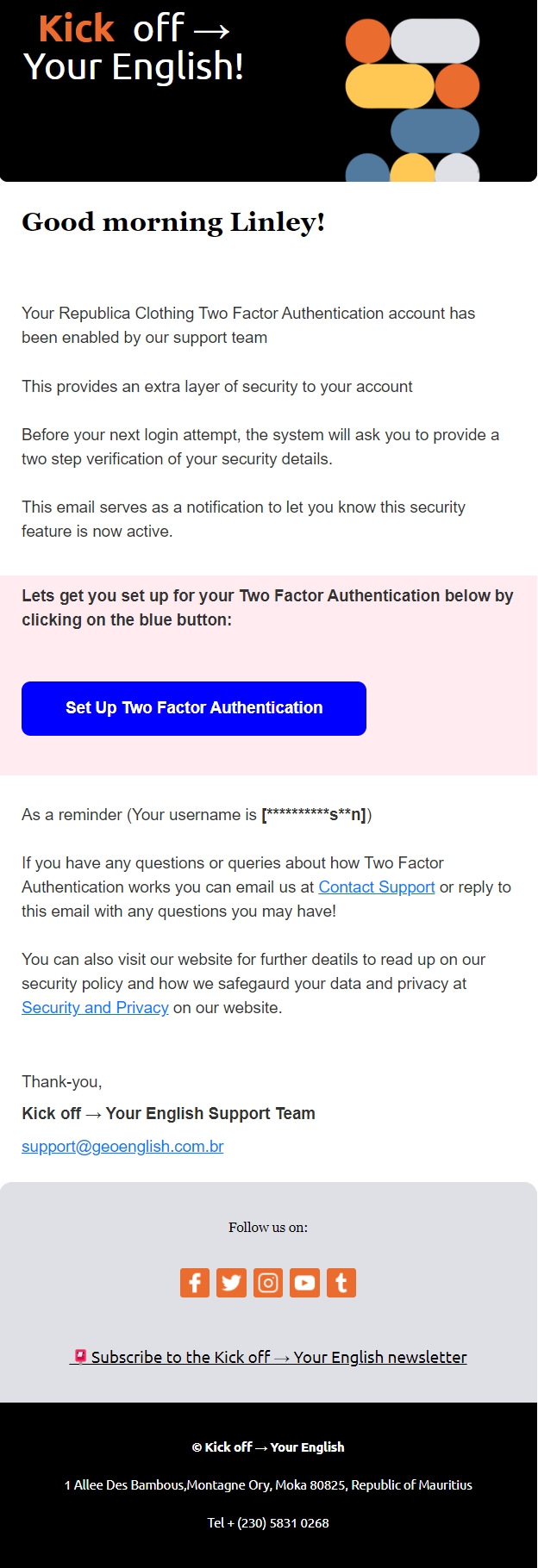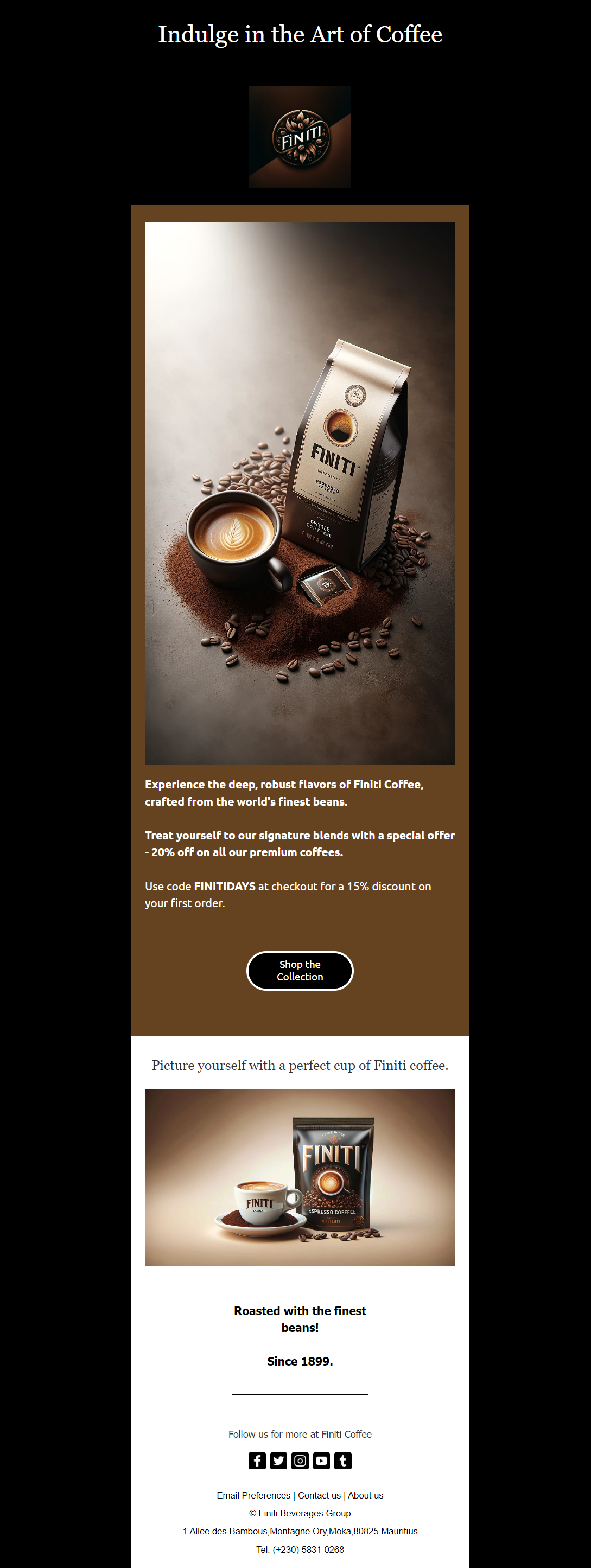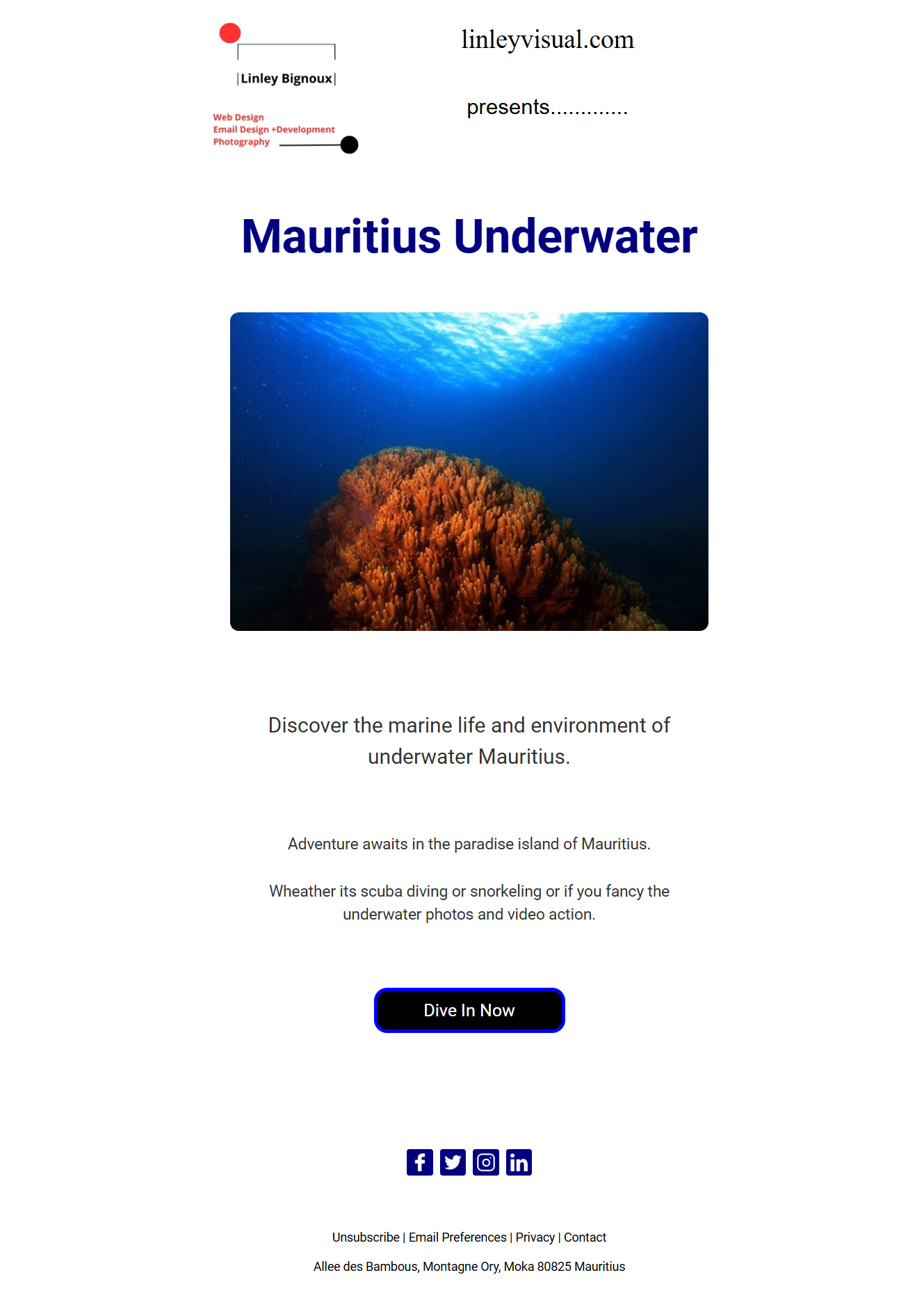
UI-User Interface/UX-User Experience: The Relation To Responsive Email Development.

The fundamental UX design principles include visual and information architecture, simplicity and usability, user-centricity, typography, accessibility, consistency, context, user control, and user testing. Please explain each one in terms of email design.

Here I will explain step by step how Responsive and Hybrid design correlate to fundamental UX design principles in the context of email design: But firstly let me explain UX (user experience) design first:

Visual and Information Architecture Email Design: Organize content in a clear, logical structure. Use headers, subheaders, and sections to guide the reader through the email. Ensure important information is prominently placed, often above the fold, to capture attention immediately.

Simplicity and Usability Email Design: Keep the design clean and clutter-free. Focus on a single primary message or call-to-action (CTA). Avoid overwhelming the reader with too much information or too many choices. Simple layouts with ample white space enhance readability and user engagement.

User-Centricity Email Design: Design emails with the user’s needs and preferences. Personalize content based on user behaviour, demographics, or past interactions. Ensure the email provides value to the recipient, whether it’s through relevant offers, helpful information, or engaging content.

Typography Email Design: Use clear, legible fonts that are easily read on all devices. Ensure a good contrast between text and background. Use different font sizes and weights to create a visual hierarchy and guide the reader’s attention to key points and CTAs.

Accessibility Email Design: Make emails accessible to all users, including those with disabilities. Use semantic HTML and ARIA landmarks. Ensure colour contrast meets accessibility standards. Provide alt text for images and use accessible fonts. Test emails with screen readers to ensure all users can access the content.

Consistency Email Design: Maintain a consistent design across all emails and align with the brand’s overall visual identity. Consistent use of colours, fonts, and design elements helps build brand recognition and makes emails feel familiar and trustworthy to recipients.

Context Email Design: Consider the context in which the email will be read. Design for various devices and screen sizes, ensuring responsive design. Tailor content to the recipient’s current situation or past interactions with your brand to make the email more relevant and engaging.

User Control Email Design: Allow users to have control over their email preferences. Provide options to manage subscription settings, such as the frequency of emails and types of content they receive. Ensure an easy and visible way to unsubscribe if they wish.

User Testing Email Design: Test emails with real users before sending them to the entire list. Use A/B testing to determine which design elements, subject lines, or CTAs perform best. Collect feedback and iterate on your designs to continuously improve the user experience.

By incorporating these UX principles into your email design, you can create more effective and engaging emails that resonate with your audience and drive better results.

Now let’s look at how UX relates to responsive design.

Here it provides a more tailored experience for viewers, taking for example buttons, font sizes, and content that is placed ideally where it is easier to read on smaller screens. You can make things scalable making it somewhat future-proof because it is equipped to adapt to a whole host of current and future devices and or technologies with different screen sizes.

While we need to consider that responsive email is more complex to develop, it makes it easier with email frameworks like MJML (MailJet Markup Language) and others like HEML, Maizzle, and Cerberus. Overall, responsive email design and development has good performance even on older email clients’ rendering engines that ensure a functional layout that works well. Fluid layouts use percentages and media queries and take less time and testing in my view.

So the question is, which one is better? Well, it depends, so no one is better than the other. It depends on the solution you are trying to provide. If you want a modern, customized email design, I feel the responsive design is the way to go and provides a better UX (user experience) on all modern devices, mobile, desktop, and tablets. However, as I have said before, it requires more complex coding and a lot of testing, so complexity equals more testing and other technical aspects.

If you want a broad solution and good compatibility and simplicity, a hybrid email design is better in my opinion since this will be used in a straightforward solution that is functional and useful with most email clients. Again, it depends on the use case.

Let’s come to the layout, will it be single-column or multi-column layouts? Single-column layouts fit on any device since they fit all information in one column reading in a line from top to bottom sequence by sequence. Single-column layouts are more responsive, so they are compatible with all devices. You do not have to restyle the template to re-adjust to the varying screen sizes. In terms of UX (user experience), it is practical and easy, and the user can see the information displayed in an inflowing manner, right?

However, as an Email developer, I found that I have to be extra creative with my design and with images, colours, typographies, and fonts since it may look too simple or bland, to be honest. In addition, single-column layouts work though, keep things simple with layouts, but you may have to work more on the colour and typographies, white space, and GIFs to add that extra interactivity.

Multi-columns, on the other hand, are great since you can logically fit more information and content, presenting more, is more visually appealing sometimes, but be careful here not to distract the email viewer. With multi-columns, you can place a few clickable links and CTAs (Call To Action) if you want or are required.

The only problem here is with coding them responsively, these types of designs require more coding complexity and problem-solving. While this is not new, more attention to detail is required to make it accessible, functional, usable, and practical.

UI (User Interface) in the Context of Email Design:

Visual and Information Architecture (UI): Ensure a visually appealing layout that aligns with your brand’s aesthetics. Use colour schemes, images, and icons that enhance the readability and visual hierarchy, making it easy for users to navigate and interact with the email content.

Simplicity and Usability (UI): Design intuitive and straightforward interfaces. Buttons and links should be easily identifiable and clickable. Use recognizable icons and simple navigation structures to enhance user interaction.

User-Centricity (UI): Create a visually engaging interface that resonates with your audience. Use personalized visuals, such as user-specific images or dynamic content blocks, to make the email feel more tailored to individual recipients.

Typography (UI): Choose fonts that are visually appealing and on-brand. Use typography to create contrast and emphasis, making important information stand out. Ensure that the chosen fonts render well across different email clients.

Accessibility (UI): Design interfaces that are easy to use for everyone. Use accessible colour schemes, and scalable text, and ensure that interactive elements like buttons are large enough to be easily clicked, even by users with limited dexterity.

Consistency (UI): Maintain a consistent visual style across all emails. This includes using the same colour palette, typography, and layout patterns. Consistency helps reinforce brand identity and provides a seamless user experience.

Context (UI): Adapt the UI to fit the context in which the email is being read. Ensure that the design is responsive and adjusts to different screen sizes and orientations, providing a seamless experience whether the email is viewed on a smartphone, tablet, or desktop.

User Control (UI): Design interfaces that allow users to easily manage their preferences. Use clear and visually distinct buttons or links for actions such as unsubscribing or adjusting email settings.

User Testing (UI): Conduct visual tests to ensure that the email design looks good across different devices and email clients. Gather feedback on the visual aspects of the email to identify any areas that need improvement.

By considering both UX and UI principles, you can create emails that are not only functional and user-friendly but also visually appealing and engaging, providing a holistic and satisfying user experience.

Factors in Design and Development of Emails What You Need TO Know Part 2.

Email development does not have to be hard, and if you follow some simple rules for coding and designing it will help immensely. Here I will discuss some of the common design and development considerations and how they can assist you in delivering email marketing campaigns at a good standard.As an Email Developer, I want to share more on what has to be considered an important part of designing, developing and coding these emails.

Design Perspective

Let’s start from a design perspective. Email design is crucial here, both in terms of form and planning it is crucial for communicating an engaging email that is aesthetically pleasing and is effective in capturing people’s attention. Remember one thing, emails are entirely read by most people; rather, they scan or skim information, scanning for what is relevant and skimming to more important details they believe they want to know more!

Layout and UX Fundamentals

Now consider the layout. Is it user-friendly and does it follow all the design principles that make the information flow smoothly from one idea to another? In this case, proper utilization of UX – user experience design fundamentals are important, namely information architecture, simplicity, usability, user-centric design, typography, accessibility, consistency of design and brand consistency in the case of email marketing development and context, user control, and last but not least, user testing.

I will not go into detail here in this article about UX email design; however, I will explain more about these aspects in another article post as there is a lot to share and consider, but you get my point.

Clarity and Legibility

Email designs have to be clear, concise, and visible, which means it has to be legible and understood easily in both text and visuals with readable content that needs to engage the audience with a solution to a problem they are trying to solve, and you need to communicate that solution to them easily.

Emails have to have readable fonts for your viewers as they will assess their email on maybe smaller devices sometimes. The fonts need to align with the screen size and be readable and stick with the message you want to convey and the brand identity.

Line Spacing

Line spacing is another important factor here since it allows text and images to “breathe,” and making text, for example, not clustered too close together is never a good thing. This aids in making the design more “special” and assists the viewer to read or scan or skim the email without it being cramped. Again, a logical flow of information that follows some sort of pattern or order, you want to guide the reader into a flow of information.

Text Copy

When writing text copy, try to keep sentences short and to the point, short and sweet! In a world where there are many distractions and where your email will be read in seconds or a very, very short time, you have to be to the point. You are competing for people’s attention and all other message and communication apps whether that be online videos, other applications or software, social media, and life in general. Remember to be short and to the point about your products or promotions, services, or messages.

Whitespace

Whitespace is another important design aspect. Keep in mind the whole space or area around the design. As I mentioned previously, let your design breathe; this will be easier for the viewer.

Information Hierarchy

Another aspect is information hierarchy. This means placing your most important information or content at the top part of your email design. Important content always comes first and the rest of the information in the email will come down in order of priority, so decide which information is important to convey or say first.

Use of Colours and Fonts

Next up is the use of colours and fonts. This is crucial here since we are dealing with both colour psychology and your branding with visual aesthetics. Here you are also dealing with the perception of your brand. Firstly, you should always use a consistent brand colour for your email marketing campaigns that are in line with your brand or company’s colour schemes. They can be the same or a variation of it. This helps with brand recognition and brand association.

Your colour usage needs to be accessible to all people. By that, I mean people with eyesight impairments, problems or disabilities, or are even colour-blind to some extent. Choosing colours that balance your brand and accessibility is highly important, so factor that in as well.

Contrasting Backgrounds and Foreground Colours

Email design has to have contrasting backgrounds and foreground colours. Anything visual is true for all design, so choose your colours wisely since the perception of your email in the inbox is going to have an impact largely because people have a psychological relationship with colours and how they contrast or complement each other is quite important.

Text and Background Colour

Again, in regards to text, background and foreground colour is essential. While using colours, the text copy should be a colour that is easily visible against a background colour. Do not use colours that do not match well, basically ones that have a low visibility or contrast ratio. When trying to read them, it’s going to be difficult for the viewer to read the text.

Simplicity of Visual Elements

Now we look at keeping your visual elements as simple as possible. Do not overload your viewer with too much information or clutter the screen with so many choices. Keep the design as simple as you can. You don’t want to distract them; you want your visual elements to guide their eyes to follow the information and content and ultimately to a call to action.

Images and Media

Try to keep your images, photos, illustrations, and GIFs appealing and interesting about the overall message of your email communication. Do not put too many GIFs, illustrations, and pictures in your email design. Your design needs to be visually pleasing, yes! However, do not overdo it.

CTA Buttons

This leads me to the CTA button – the call to action button. You need to tell the viewers what action you want them to do or at least guide them to that. What action do you want them to take? Is it to sign up for a newsletter, get a discount, purchase a product that’s on offer, download a free ebook, or enquire about the product you are showcasing? You can decide what they will do or what you want them to do, but what’s important here is to mark or place on your email design CTA and put it in a strategic position with preferably adequate white space surrounding your CTA.

Multiple CTAs

You can also have more than one CTA button, 2, 3, or 4 buttons if it’s appropriate to do so, so that your viewers have every chance to click on the button as they read through your email. This makes it easier for them as they read; there is always some button they can click on nearby. Make it easy for them to take some sort of action.

Button Colour Choice

Again here, button colour choice is going to be important. Consider the colour of the actual button and its text colour and text wording. Of course, it has to correspond to your brand to grab the attention of those reading their email inbox.

Mobile Design

One more is designing for mobile devices or smaller devices in mind since they have become more and more popular over the years. Emails will be viewed on smaller devices, so this needs to be factored in. When viewers look at your email, it needs to be 100 per cent visible and legible. Here, from a design and development viewpoint, it will have to be more responsive or developed using what is called a hybrid design approach.

Responsive Email Design

Let me break this down a bit and explain. Responsive email design just means using media queries to adjust the overall layout based on the available screen size of a given device. This gives optimal viewing on any device. The email design looks good on all screen sizes, and this is done by rearranging the layout but changing the structure. It fits and adapts the design but does not change the structure of the email.

Media Queries and Breakpoints

Media queries are a feature in CSS that allows you to apply different styles to a webpage (or an email) based on the characteristics of the device displaying it. This includes factors like screen size, resolution, and orientation (portrait or landscape). They help create responsive designs that look good on both large screens (like desktops) and small screens (like smartphones). For example, you can use media queries to change the font size or layout of a webpage when it is viewed on a mobile device compared to when it is viewed on a desktop computer.

Breakpoints are specific points defined in your CSS where the layout and design of a webpage or email will change to better fit different screen sizes. They are used in conjunction with media queries to create responsive designs. For example, you might set a breakpoint at 600 pixels wide, so that any screen width below this point shows a mobile-friendly layout, and any width above it shows a desktop-friendly layout.

Hybrid Email Design

On the other hand, hybrid email design puts together what they call fluid layouts with the addition of media queries to make the email readable and function correctly with email clients that do not support media queries. It has more consistent support across email clients, even those with limited support for media queries.

Development and Coding Perspective

From a development and coding perspective as an email developer, it may sometimes be easier to write up code when compared to responsive email coding given the fact that it relies on fluid layout techniques and percentages to control the behaviour of the sections and columns rather than breakpoints.

Some Important Email Development Considerations You Need To Think Of

Some important factors in any email marketing campaign from the coding and email development point of view include considering overall design, layout, and structure, while also achieving the campaign’s goals and targeting the intended audience.

While this is a generalization, numerous factors need to be considered. The process of developing email designs and coding them from scratch requires intricate work and thought, largely depending on where the email will ultimately be displayed, such as email clients like Outlook, Gmail, and webmail providers, as well as the browser and operating system (e.g., Android or Apple) in use.

Email clients are applications used to access and manage a user’s email, such as Microsoft Outlook, Google Gmail, Apple Mail, etc. These clients can be standalone applications on a desktop or mobile device, or they can be web-based services accessed through a browser.

The actual design side of things is subjective and can take many forms, influenced by overall design considerations, creative input, marketing and advertising factors, and, of course, the coding side of things—HTML (Hypertext Markup Language) and CSS (Cascading Style Sheets).

This work is intricate, as mentioned before, and requires problem-solving. Sometimes it can be difficult, other times easier, but it will often be complex, requiring significant time and resources depending on the project type or design requirements. Email development requires attention to detail for various reasons, which I will explain further.

Let’s consider some of the art and science of email development. Creating email designs from scratch requires good attention to detail, mainly because of how emails may or may not be displayed or rendered in clients’/customers’ email inboxes. Here, email rendering is essential.

Email rendering is how an email is displayed—the visual aspects of how it looks across different email clients, devices, browsers, and operating systems. This is crucial since each email client, such as Gmail, Apple Mail, and Outlook, is a major player in rendering your email due to the popularity of these companies and services. Other factors include the devices people use to view their email inboxes, whether desktops, mobile devices, or tablets, which will render differently because these companies have their rendering engines.

A rendering engine acts like an interpreter or translator that takes the code in an email and translates what it interprets from the HTML and CSS, then outputs what you see on your screen.

Email clients like Outlook, Gmail, webmail services, Apple Mail, etc., have their rendering engines and interpret in their way, so an email viewed on one device will look different on another device or when viewed within different email accounts. Browsers and email accounts will also display differently on mobile and desktops depending on the rendering engines on your email client accounts.

Another aspect to consider is the HTML and CSS support that email clients provide, which can vary greatly. For example, Gmail has limited support for CSS, whereas Apple Mail supports more advanced styling.

Designing and developing with responsiveness in mind is another consideration. Responsive design refers to the use of media queries to adjust to different screen sizes available across mobile, desktop, and tablet devices, especially given the marked increase in the use of mobile devices over the years. Some designs use a mobile-first approach, then design for desktop second. With more people viewing their email on mobile devices, responsive design is necessary. The format and medium must be displayed correctly and be accessible for viewers to read their inboxes with ease.

Using inline CSS is very important since most email clients strip out external style sheets or embedded CSS, making inline styles necessary.

Another significant point is using tables for layout. This helps maintain a consistent visual rendering across all devices and aids in email structure when email clients render the content on your screen.

In terms of colour, fonts, images, and text, fallbacks (backups) are crucial in case one font or colour does not load or is not rendered well. This ensures a good user experience (UX), even if certain elements, fonts, images, and styles do not display as intended.

Additionally, emails need to be thoroughly tested to see how they will display and render on all the different devices, email clients, and email client versions (e.g., Outlook desktop, Outlook Live, Outlook mobile). Browsers and operating systems (Android or Apple) can significantly impact the final display.

Developing a good testing regime will ensure that nothing is missing from your original design, making your email marketing campaigns clear and concise and providing accurate information.

Moreover, detailed email testing is necessary because there are many ways your email design can look and even omit certain information if not coded or developed well.

These are some of the specific email development issues that need to be fundamentally considered for your email campaigns, ensuring a good user experience (UX) and user interface (UI) for clients accessing your emails in their inboxes.

Linley Bignoux – Email Developer

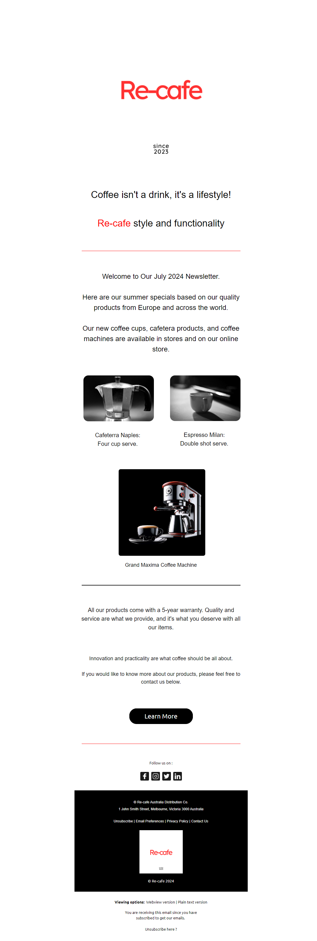
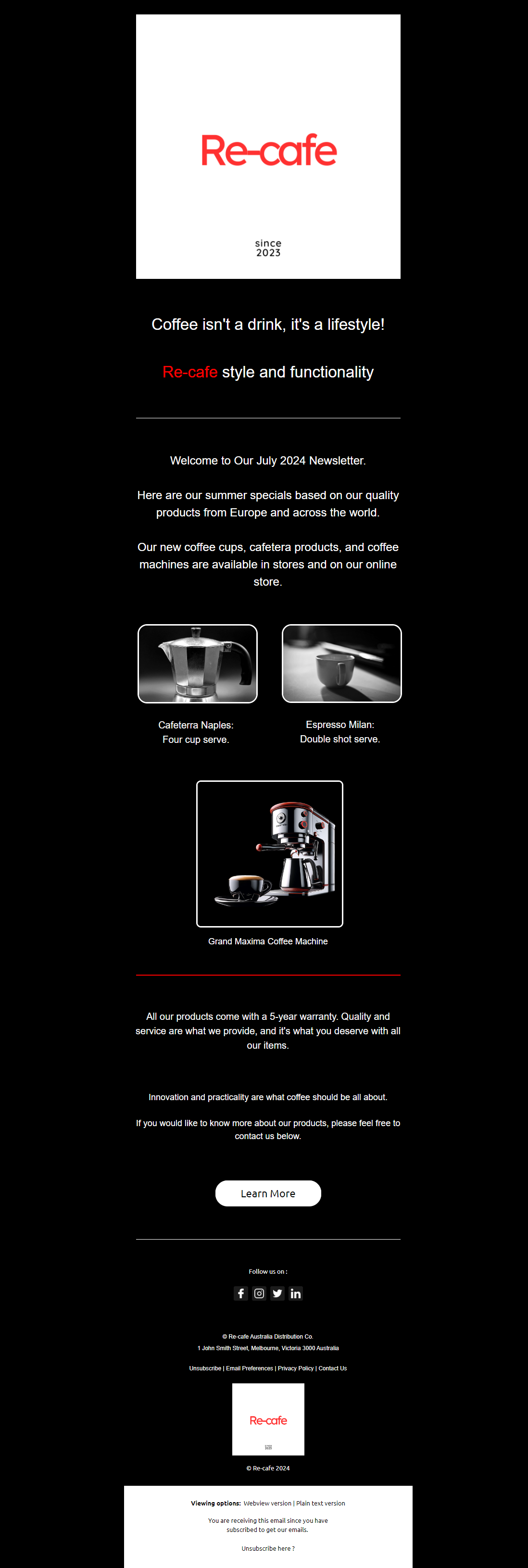
Coffee Distribution Company Monthly Email Newsletter Email Design 4

The aim of the monthly email newsletter for a coffee distribution company is to keep subscribers updated with the latest news, promotions, and product offerings. This email should engage readers, provide valuable content, and encourage continuous interaction with the brand.

The email should:

  1. Welcome Subscribers:
    • Begin with a friendly greeting to introduce the monthly newsletter.
    • Give a brief overview of what’s included in this edition.
  2. Share Latest Updates:
    • Provide company updates, new product releases, and recent collaborations.
    • Announce upcoming events, trade shows, or special projects.
  3. Highlight Products:
    • Feature select coffee products, showcasing new arrivals and popular items.
    • Include detailed descriptions, benefits, and high-quality images.
  4. Offer Tips and Insights:
    • Share useful content such as coffee brewing tips, industry trends, and sustainability practices.
    • Include educational articles or blog posts.
  5. Promote Special Deals:
    • Inform subscribers about current discounts, exclusive deals, or special offers.
    • Create urgency with limited-time promotions or special codes.
  6. Feature Customer Stories:
    • Share testimonials or reviews from satisfied customers.
    • Include photos or quotes to personalize the experience and build trust.
  7. Include Clear Call-to-Actions:
    • Encourage specific actions like visiting the website, making a purchase, or following on social media.
    • Use compelling CTAs like “Shop Now,” “Learn More,” or “Join Us.”
  8. Ensure Visual Appeal and Consistency:
    • Design the email to be visually appealing and aligned with the brand’s identity.
    • Use a clean layout with consistent colors, fonts, and logos.
  9. Optimize for All Devices:
    • Ensure the email is optimized for both mobile and desktop devices.
    • Test across various email clients and browsers to ensure correct display.
  10. Offer Support and Resources:
    • Include customer support contact information for questions or assistance.
    • Provide links to the company’s website, blog, or social media pages.

By incorporating these elements, the monthly newsletter will effectively keep subscribers informed, engaged, and connected with the coffee distribution company, enhancing their overall experience.

Coffee Distribution Company Monthly Email Newsletter Email Design 3

  • The goal of the monthly email newsletter for a coffee distribution company is to keep subscribers updated with the latest news, promotions, and product information. This email should engage readers, offer valuable insights, and encourage ongoing interaction with the brand.
  • The email should:
  • Greet Subscribers:
    • Start with a warm welcome to the monthly newsletter.
    • Provide a quick summary of the content included in this edition.
  • Announce Latest News:
    • Share company news, new product launches, and recent partnerships.
    • Update on upcoming events, trade shows, or special initiatives.
  • Showcase Products:
    • Highlight select coffee products, featuring new arrivals and top sellers.
    • Include detailed descriptions, benefits, and high-quality images.
  • Provide Industry Tips and Insights:
    • Share useful content such as coffee brewing tips, industry trends, and sustainability practices.
    • Include educational articles or blog posts.
  • Highlight Special Promotions:
    • Inform subscribers about current discounts, exclusive deals, or special offers.
    • Create urgency with limited-time promotions or special codes.
  • Feature Customer Stories:
    • Share testimonials or reviews from happy customers.
    • Include photos or quotes to personalize the experience and build trust.
  • Include Clear Call-to-Actions:
    • Encourage specific actions like visiting the website, purchasing, or following on social media.
    • Use compelling CTAs like “Shop Now,” “Read More,” or “Join Us.”
  • Ensure Visual Appeal and Brand Consistency:
    • Design the email to be visually appealing and aligned with the brand’s identity.
    • Use a clean layout with consistent colours, fonts, and logos.
  • Optimize for All Devices:
    • Ensure the email is optimized for both mobile and desktop devices.
    • Test across various email clients and browsers to ensure correct display.
  • Offer Support and Resources:
    • Include customer support contact information for questions or assistance.
    • Provide links to the company’s website, blog, or social media pages.
  • Incorporating these elements will help the monthly newsletter effectively inform, engage, and connect with subscribers, enhancing their experience with the coffee distribution company.
  • 4o

Coffee Distribution Company Monthly Email Newsletter Email Design 1

  • The purpose of the monthly email newsletter for a coffee distribution company is to keep subscribers informed about the latest news, promotions, and updates related to the company’s coffee products and services. The email should engage recipients, provide valuable content, and encourage them to stay connected with the brand.
  • The email should:
  • Introduce the Monthly Newsletter:
    • Start with a warm and engaging introduction welcoming recipients to the monthly newsletter.
    • Mention a brief overview of what they can expect in this edition.
  • Highlight the Latest News and Updates:
    • Include sections for company news, product launches, or new partnerships.
    • Share updates about upcoming events, trade shows, or special projects.
  • Showcase Featured Products:
    • Highlight a selection of coffee products, including new arrivals or bestsellers.
    • Provide detailed descriptions, benefits, and high-quality images of the featured products.
  • Share Industry Insights and Tips:
    • Offer valuable content such as coffee brewing tips, industry trends, or sustainability practices.
    • Include articles or blog posts that educate and engage the audience.
  • Include Special Offers and Promotions:
    • Provide information on any current promotions, discounts, or exclusive deals for newsletter subscribers.
    • Create a sense of urgency with limited-time offers or special codes.
  • Engage with Customer Stories and Testimonials:
    • Share success stories, testimonials, or reviews from satisfied customers.
    • Include photos or quotes to add a personal touch and build credibility.
  • Provide a Clear Call-to-Action:
    • Encourage recipients to take specific actions, such as visiting the website, making a purchase, or following on social media.
    • Use clear and compelling CTAs like “Shop Now,” “Read More,” or “Join the Conversation.”
  • Ensure Visual Appeal and Brand Consistency:
    • Design the email to be visually appealing and aligned with the company’s branding.
    • Use a clean and organized layout with consistent colors, fonts, and logos.
  • Guarantee Responsive Design:
    • Optimize the email for both mobile and desktop devices.
    • Test the email across various email clients and browsers to ensure it displays correctly and provides a seamless user experience.
  • Offer Support and Additional Resources:
    • Include contact information for customer support if recipients have questions or need assistance.
    • Provide links to additional resources, such as the company’s website, blog, or social media pages.
  • By incorporating these elements, the monthly newsletter will effectively keep subscribers informed, engaged, and connected with the coffee distribution company.

Online Womens Handbags Store Email Design 3

  • The purpose of the online women’s handbags store email design is to promote the latest collection of handbags, highlight special offers, and encourage recipients to make a purchase. The email should be visually appealing, informative, and persuasive to drive sales and engagement.
  • The email should:
  • Introduce the Latest Collection:
    • Start with an eye-catching introduction to the newest collection of women’s handbags.
    • Highlight the unique styles, materials, and trends featured in the collection.
  • Showcase Key Features:
    • Emphasize the quality, craftsmanship, and functionality of the handbags.
    • Include details about different styles available, such as totes, clutches, crossbody bags, and more.
  • Highlight Special Offers:
    • Provide information on any current promotions, discounts, or exclusive deals for the handbags.
    • Mention limited-time offers to create a sense of urgency.
  • Include a Clear Call-to-Action:
    • Use a prominent and persuasive call-to-action, such as “Shop Now,” “Explore the Collection,” or “Get Your Discount.”
    • Ensure the CTA links directly to the product page or promotional landing page.
  • Provide Engaging Visuals:
    • Incorporate high-quality images of the handbags, showcasing different angles and styles.
    • Use visually appealing graphics and colours that align with the brand’s identity.
  • Ensure Visual Appeal and Brand Consistency:
    • Design the email to be visually appealing and consistent with the brand’s look and feel.
    • Use a clean and organized layout to make the email easy to read and navigate.
  • Guarantee Responsive Design:
    • Optimize the email for both mobile and desktop devices.
    • Test the email across various email clients and browsers to ensure it displays correctly and provides a seamless user experience.
  • Offer Support and Additional Information:
    • Include contact information for customer support in case recipients have questions or need assistance with their purchase.
    • Provide links to the store’s website, social media pages, or additional resources related to the handbag collection.

Online English Classes Promotion Email Design 9

  • The purpose of the online English classes promotion email design is to attract potential learners, inform them about the benefits of enrolling, and encourage them to sign up for the classes. The email should be compelling, informative, and visually appealing to drive engagement and conversions.
  • The email should:
  • Introduce the Online English Classes:
    • Start with an engaging introduction about the online English classes offered.
    • Highlight the flexibility and convenience of learning English online.
  • Highlight Key Features:
    • Emphasize the unique features of the classes, such as live interactive sessions, experienced instructors, and personalized lesson plans.
    • Mention any additional resources provided, like access to digital materials, practice exercises, and community forums.
  • Showcase Benefits:
    • Explain the advantages of learning English through these classes, including improved communication skills, enhanced career opportunities, and cultural enrichment.
    • Include testimonials or success stories from past students to add credibility.
  • Include a Special Offer or Call-to-Action:
    • Offer a special promotion, discount, or a free trial for new sign-ups.
    • Provide a clear and compelling call-to-action, such as “Enroll Now,” “Start Your Free Trial,” or “Join Our Classes,” with a direct link to the enrollment page.
  • Provide Engaging Visuals:
    • Use high-quality images or graphics related to the English classes to capture attention.
    • Ensure the visuals align with the content and highlight the interactive and engaging nature of the classes.
  • Ensure Visual Appeal and Brand Consistency:
    • Design the email to be visually appealing and consistent with the brand’s identity, including colours, fonts, and logo.
    • Use a clean and organized layout to make the email easy to read and navigate.
  • Guarantee Responsive Design:
    • Optimize the email for both mobile and desktop devices.
    • Test the email across various email clients and browsers to ensure it displays correctly and provides a seamless user experience.
  • Offer Support and Additional Resources:
    • Include contact information for support if users have questions or need help with the enrollment process.
    • Provide links to additional resources, FAQs, or sample lessons related to the English classes.

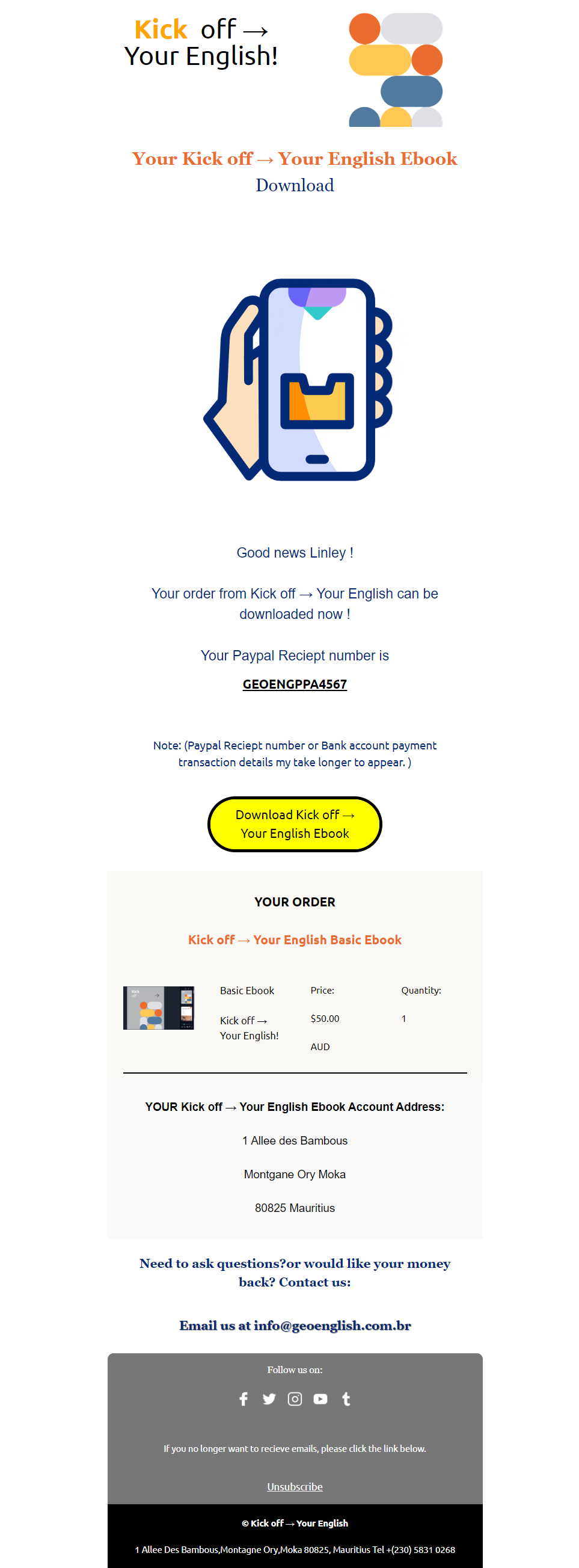
English Classes Interactive Ebook Email Design 8

  • The purpose of the English classes interactive eBook email design is to promote an interactive learning resource that enhances English language skills. The email should generate interest in the eBook, highlight its interactive features, and encourage recipients to engage with it.
  • The email should:
  • Introduce the Interactive eBook:
    • Start with an engaging introduction about the interactive eBook designed to improve English language skills.
    • Mention the unique features of the eBook, such as interactive exercises, multimedia content, and practical language applications.
  • Highlight Key Features:
    • Emphasize the benefits of the eBook, including interactive quizzes, language games, and real-life scenarios.
    • Detail how these features can help users practice and enhance their English proficiency.
  • Showcase Benefits:
    • Explain how the eBook supports various learning styles and adapts to individual needs.
    • Include examples of what users can learn, such as grammar rules, vocabulary expansion, and conversational skills.
  • Include a Special Offer or Call-to-Action:
    • Offer any special promotions, discounts, or exclusive access related to the eBook.
    • Provide a clear call-to-action, such as “Download Now,” “Get Started,” or “Claim Your eBook,” with a direct link to the eBook’s download or purchase page.
  • Provide Engaging Visuals:
    • Incorporate high-quality images or graphics related to the eBook to capture attention.
    • Ensure the visuals align with the content and highlight the eBook’s interactive aspects.
  • Ensure Visual Appeal and Brand Consistency:
    • Design the email to be visually appealing and consistent with the brand’s identity, including colors, fonts, and logo.
    • Use a clean and organized layout to make the email easy to read and navigate.
  • Guarantee Responsive Design:
    • Optimize the email for both mobile and desktop devices.
    • Test the email across various email clients and browsers to ensure it displays correctly and provides a seamless user experience.
  • Offer Support and Additional Resources:
    • Include contact information for support if users have questions or need help with the eBook.
    • Provide links to additional resources or FAQs related to the eBook and its content.
  • 4o mini
  • You’ve hit the Free plan limit for GPT-4o.
  • Responses will use our basic model unt

English Classes Interactive Ebook Email Design 8

  • The purpose of the English class’s interactive eBook email design is to promote an interactive learning resource that enhances English language skills. The email should generate interest in the eBook, highlight its interactive features, and encourage recipients to engage with it.
  • The email should:
  • Introduce the Interactive eBook:
    • Start with an engaging introduction about the interactive eBook designed to improve English language skills.
    • Mention the unique features of the eBook, such as interactive exercises, multimedia content, and practical language applications.
  • Highlight Key Features:
    • Emphasize the benefits of the eBook, including interactive quizzes, language games, and real-life scenarios.
    • Detail how these features can help users practice and enhance their English proficiency.
  • Showcase Benefits:
    • Explain how the eBook supports various learning styles and adapts to individual needs.
    • Include examples of what users can learn, such as grammar rules, vocabulary expansion, and conversational skills.
  • Include a Special Offer or Call-to-Action:
    • Offer any special promotions, discounts, or exclusive access related to the eBook.
    • Provide a clear call-to-action, such as “Download Now,” “Get Started,” or “Claim Your eBook,” with a direct link to the eBook’s download or purchase page.
  • Provide Engaging Visuals:
    • Incorporate high-quality images or graphics related to the eBook to capture attention.
    • Ensure the visuals align with the content and highlight the eBook’s interactive aspects.
  • Ensure Visual Appeal and Brand Consistency:
    • Design the email to be visually appealing and consistent with the brand’s identity, including colors, fonts, and logo.
    • Use a clean and organized layout to make the email easy to read and navigate.
  • Guarantee Responsive Design:
    • Optimize the email for both mobile and desktop devices.
    • Test the email across various email clients and browsers to ensure it displays correctly and provides a seamless user experience.
  • Offer Support and Additional Resources:
    • Include contact information for support if users have questions or need help with the eBook.
    • Provide links to additional resources or FAQs related to the eBook and its content.

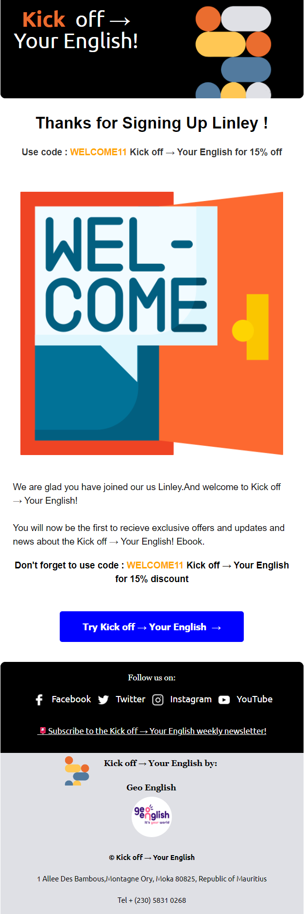
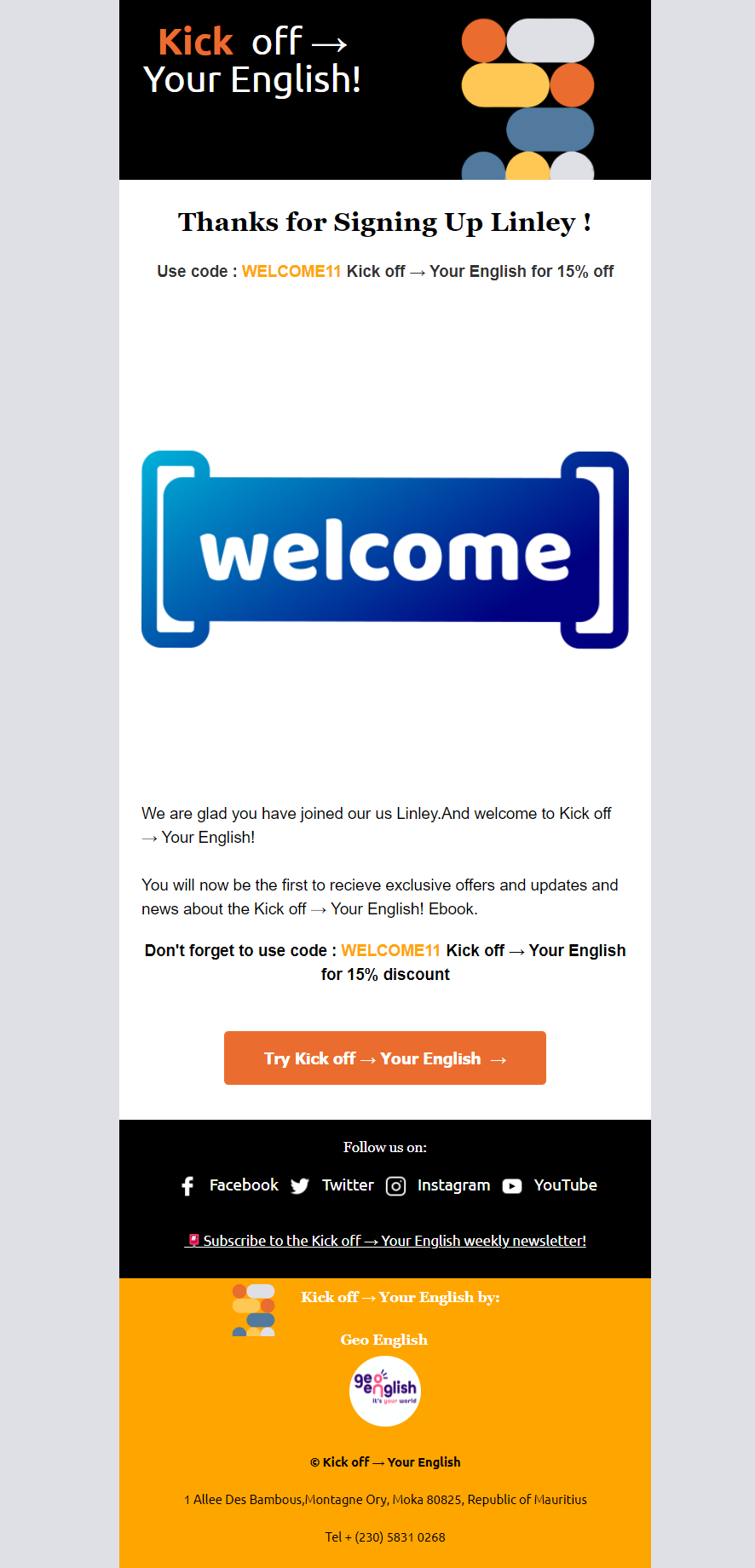
Account Welcome Email Design 8

  • The purpose of the account welcome email design is to greet new users, confirm their account setup, and guide them on how to get started with their new account. The email should create a positive first impression, provide essential information, and encourage engagement with the platform or service.
  • The email should:
  • Welcome the New User:
    • Start with a warm and friendly greeting.
    • Express excitement about their new account and thank them for joining.
  • Confirm Account Setup:
    • Clearly state that their account has been successfully created or activated.
    • Include any relevant details such as username or account ID for reference.
  • Provide Getting Started Information:
    • Offer a brief overview of key features and benefits of the platform or service.
    • Include instructions or links to help them get started, such as setting up their profile, exploring key features, or accessing a tutorial.
  • Highlight Important Next Steps:
    • Guide the user on what to do next, like verifying their email, completing their profile, or starting their first task.
    • Provide direct links or buttons to these next steps.
  • Offer Support and Resources:
    • Include contact information for customer support in case they need assistance.
    • Provide links to help resources, FAQs, or a knowledge base for further guidance.
  • Ensure Visual Appeal:
    • Design the email to be visually engaging with a clean, professional layout.
    • Use branding elements such as colors, fonts, and logos to align with the company’s identity.
  • Guarantee Responsive Design:
    • Ensure the email is optimized for both mobile and desktop devices.
    • Test the email across different email clients and browsers to ensure it displays correctly and provides a seamless experience.
  • 4o mini

Account Welcome Email Design 7

  • The purpose of the account welcome email design is to greet new users, confirm their account setup, and guide them on how to get started with their new account. The email should create a positive first impression, provide essential information, and encourage engagement with the platform or service.
  • The email should:
  • Welcome the New User:
    • Start with a warm and friendly greeting.
    • Express excitement about their new account and thank them for joining.
  • Confirm Account Setup:
    • Clearly state that their account has been successfully created or activated.
    • Include any relevant details such as username or account ID for reference.
  • Provide Getting Started Information:
    • Offer a brief overview of key features and benefits of the platform or service.
    • Include instructions or links to help them get started, such as setting up their profile, exploring key features, or accessing a tutorial.
  • Highlight Important Next Steps:
    • Guide the user on what to do next, like verifying their email, completing their profile, or starting their first task.
    • Provide direct links or buttons to these next steps.
  • Offer Support and Resources:
    • Include contact information for customer support in case they need assistance.
    • Provide links to help resources, FAQs, or a knowledge base for further guidance.
  • Ensure Visual Appeal:
    • Design the email to be visually engaging with a clean, professional layout.
    • Use branding elements such as colors, fonts, and logos to align with the company’s identity.
  • Guarantee Responsive Design:
    • Ensure the email is optimized for both mobile and desktop devices.
    • Test the email across different email clients and browsers to ensure it displays correctly and provides a seamless experience.
  • 4o mini

English Class Interactive Ebook Promotion Email Design

  • The purpose of the English class interactive eBook promotion email design is to introduce subscribers to a valuable resource for learning English and encourage them to engage with the interactive eBook. The email should highlight the benefits of the eBook, drive interest, and prompt action.
  • The email should:
  • Introduce the eBook:
    • Clearly introduce the interactive eBook and its purpose.
    • Mention that it’s a resource for enhancing English language skills.
  • Highlight Key Features:
    • Emphasize the interactive elements of the eBook, such as quizzes, exercises, and multimedia content.
    • Detail the educational benefits, like improved grammar, vocabulary, and practical usage.
  • Showcase Benefits:
    • Explain how the eBook can help users achieve their English learning goals.
    • Include testimonials or success stories if available to add credibility.
  • Offer a Special Promotion:
    • Provide information on any special offers, discounts, or exclusive deals for the eBook.
    • Include a promotional code or link to access the offer.
  • Include a Clear Call-to-Action:
    • Use a prominent call-to-action, such as “Download Now,” “Get Your eBook,” or “Start Learning.”
    • Ensure the CTA is easy to find and leads directly to the download or purchase page.
  • Ensure Visual Appeal:
    • Design the email to be visually engaging with high-quality images or graphics related to the eBook.
    • Maintain a clean and attractive layout that is consistent with the brand’s identity.
  • Guarantee Responsive Design:
    • Make sure the email looks good on both mobile and desktop devices.
    • Test the email across various email clients and browsers to ensure proper rendering and a smooth user experience.
  • Provide Support Information:
    • Offer contact details for customer support in case users have questions or need assistance with the eBook.
    • Include links to FAQs or help resources related to the eBook and its content.
  • 4o mini

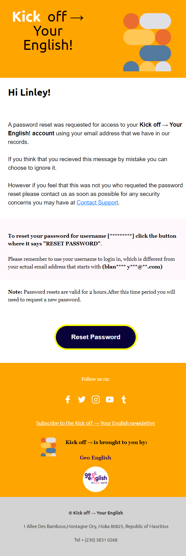
Reset Password Notification Email Design 6

  • The purpose of the reset password notification email design is to securely guide users through the process of resetting their password. The email should confirm the request, provide a secure password reset link, and offer support if needed.
  • The email should:
  • Confirm Password Reset Request:
    • Clearly state that a password reset request has been received.
    • Assure users that their request is being processed.
  • Provide Secure Link:
    • Include a prominent, secure link or button to initiate the password reset process.
    • Mention that the link is time-sensitive and should be used within a specified period (e.g., 24 hours).
  • Explain the Process:
    • Briefly outline the steps the user needs to follow to reset their password.
    • Assure them that the process is simple and secure.
  • Offer Support Information:
    • Provide contact details for customer support if they encounter issues or did not request the password reset.
    • Include links to relevant help center articles or FAQs about password recovery.
  • Ensure Visual Appeal:
    • Design the email to be clean, clear, and easy to navigate.
    • Use a simple layout with clear instructions and a visually distinct call-to-action button.
  • Guarantee Responsive Design:
    • Ensure the email displays well on both mobile and desktop devices.
    • Test across different email clients and browsers to ensure a smooth and consistent experience.
  • Emphasize Security:
    • Reassure users that their security is a priority and that the reset process is safe.
    • Include information on why it’s important to choose a strong password and keep it secure.
  • 4o mini

Monthly Newsletter Email Design 4

  • The purpose of a monthly newsletter email design is to keep subscribers informed about the latest updates, news, and content from the brand or organization regularly. The email should provide valuable information, engage readers, and drive traffic to additional resources or content.
  • The email should:
  • Welcome and Introduction:
    • Start with a friendly greeting and a brief overview of what’s included in this month’s issue.
    • Set the tone for the content and build anticipation.
  • Highlight Key Topics:
    • Feature the main stories, updates, or topics for the month.
    • Use engaging headlines and brief summaries to capture interest.
    • Include links to full articles, blog posts, or additional content for more in-depth reading.
  • Showcase Visuals:
    • Incorporate high-quality images, graphics, or videos relevant to the content.
    • Ensure visuals are well-integrated with the text and enhance the overall appeal.
  • Offer Value:
    • Provide exclusive content, special offers, or important updates that are valuable to the subscribers.
    • Include tips, insights, or highlights that align with the interests of the audience.
  • Encourage Engagement:
    • Use clear calls-to-action (CTAs) to prompt readers to take specific actions, such as “Read More,” “Explore Now,” or “Shop the Collection.”
    • Include links to social media profiles, events, or community forums where subscribers can engage further.
  • Maintain Consistency:
    • Design the email to reflect the brand’s identity, including colors, fonts, and logo.
    • Ensure a consistent layout and style to reinforce brand recognition.
  • Ensure Mobile Responsiveness:
    • Optimize the email for both mobile and desktop devices.
    • Test the email across various email clients and browsers to ensure it displays correctly and is easy to read on all platforms.
  • Include Subscription Management Options:
    • Provide options for subscribers to manage their preferences, update their information, or unsubscribe if needed.
    • Make it simple for readers to adjust their subscription settings or opt out of future issues.
  • 4o mini

Subscription Payment Notification Email Design 5

  • The purpose of the subscription payment notification email design is to inform customers about the status of their subscription payments. The email should provide clear details about the payment, and any actions required, and offer support if needed.
  • The email should:
  • Confirm Payment Status:
    • Clearly state whether the payment for the subscription was successful or if there was an issue.
    • For clarity, include the transaction’s date, amount, and reference.
  • Provide Payment Details:
    • Offer details about the subscription plan, including the renewal date, plan features, and payment amount.
    • If applicable, mention any changes in the subscription terms or pricing.
  • Action Required:
    • If the payment failed, explain the reason and provide steps to resolve the issue, such as updating payment information or retrying the payment.
    • Include a direct link or button to the payment update or subscription management page.
  • Include a Clear Call-to-Action:
    • Use a straightforward call-to-action, such as “Update Payment Info,” “Retry Payment,” or “Manage Subscription.”
    • Ensure the call-to-action is easy to locate and use.
  • Offer Support Information:
    • Provide contact information for customer support in case the recipient needs assistance.
    • Include links to FAQs or help centre articles relevant to payment or subscription issues.
  • Ensure Visual Appeal:
    • Design the email to be visually appealing, mobile-friendly, and consistent with the brand’s identity.
    • Use a clean layout, clear language, and engaging visuals to enhance readability and user experience.
  • Guarantee Responsive Design:
    • Ensure the email displays correctly on both mobile and desktop devices.
    • Test the email across various browsers, operating systems, and email clients to ensure consistent performance and a seamless user experience.

Account Set Up Confirmation Email Design 5

  • The purpose of the account set-up confirmation email design is to let users know that their account has been successfully created, provide them with important details, and guide them on what to do next. The email should make users feel welcome and help them get started smoothly.
  • The email should:
  • Confirm Account Creation:
    • Let the user know their account is now active.
    • Include a friendly confirmation message.
  • Provide Account Details:
    • Share important details like the username or ID and any plan information.
    • Give a brief overview of what’s available with their new account.
  • Guide Next Steps:
    • Offer clear instructions on how to log in, complete their profile, or start using their account.
    • Include links to helpful resources or guides.
  • Include a Clear Call-to-Action:
    • Use a straightforward call-to-action, such as “Log In Now,” “Start Exploring,” or “Set Up Your Profile.”
    • Link directly to the login page or account setup section.
  • Offer Support Information:
    • Provide contact details for support if they need help.
    • Include links to FAQs or help articles for common questions.
  • Ensure Visual Appeal:
    • Design the email to look good on both mobile and desktop.
    • Use a simple layout, eye-catching visuals, and clear language to make the email easy to read.
  • Guarantee Responsive Design:
    • Make sure the email looks great on all devices and email clients.
    • Test it across different browsers and operating systems to ensure a smooth experience.

Account Welcome Email Design 4

  • The purpose of the welcome email notification design is to warmly greet new subscribers, introduce them to the brand, and provide essential information to get them started. The email should create a positive first impression, encourage engagement, and offer support.
  • The email should:
  • Welcome the Subscriber:
    • Greet the new subscriber and express appreciation for joining.
    • Set a positive and friendly tone.
  • Introduce the Brand:
    • Provide a brief introduction to the brand, its mission, and values.
    • Highlight key benefits and features of the service or product.
  • Offer Key Information:
    • Include important details, such as account setup steps, navigation tips, or how to access resources.
    • Provide links to popular content, products, or services.
  • Include a Clear Call-to-Action:
    • Use a compelling call-to-action, such as “Get Started,” “Explore Now,” or “Set Up Your Account.”
    • Link directly to relevant pages or resources.
  • Provide Support Information:
    • Offer contact information for customer support.
    • Include links to FAQs, help center articles, or community forums.
  • Ensure Visual Appeal:
    • Design the email to be visually appealing, mobile-friendly, and consistent with the brand’s identity.
    • Use engaging visuals, a clean layout, and clear language to ensure the message is easy to understand.
  • Guarantee Responsive Design:
    • Ensure the email renders correctly on both mobile and desktop devices.
    • Test the email across various browsers, operating systems, and email clients to ensure consistent performance and a seamless user experience.
  • Encourage Further Engagement:
    • Invite the subscriber to follow on social media, join the community, or participate in upcoming events.
    • Highlight any exclusive offers or content available to new subscribers.

Welcome Email Notification Email Design

  • The purpose of the welcome email notification design is to warmly greet new subscribers, introduce them to the brand, and provide essential information to get them started. The email should create a positive first impression, encourage engagement, and offer support.
  • The email should:
  • Welcome the Subscriber:
    • Greet the new subscriber and express appreciation for joining.
    • Set a positive and friendly tone.
  • Introduce the Brand:
    • Provide a brief introduction to the brand, its mission, and values.
    • Highlight key benefits and features of the service or product.
  • Offer Key Information:
    • Include important details, such as account setup steps, navigation tips, or how to access resources.
    • Provide links to popular content, products, or services.
  • Include a Clear Call-to-Action:
    • Use a compelling call-to-action, such as “Get Started,” “Explore Now,” or “Set Up Your Account.”
    • Link directly to relevant pages or resources.
  • Provide Support Information:
    • Offer contact information for customer support.
    • Include links to FAQs, help centre articles, or community forums.
  • Ensure Visual Appeal:
    • Design the email to be visually appealing, mobile-friendly, and consistent with the brand’s identity.
    • Use engaging visuals, a clean layout, and clear language to ensure the message is easy to understand.
  • Guarantee Responsive Design:
    • Ensure the email renders correctly on both mobile and desktop devices.
    • Test the email across various browsers, operating systems, and email clients to ensure consistent performance and a seamless user experience.
  • Encourage Further Engagement:
    • Invite the subscriber to follow on social media, join the community, or participate in upcoming events.
    • Highlight any exclusive offers or content available to new subscribers.
  • 4o

Online Sunglasses Store Promo Email Design

  • The purpose of the online sunglasses store promo email design is to inform and excite potential customers about a special promotion on sunglasses. The email should highlight key features of the products, and special offers, and create a sense of urgency to encourage purchases.
  • The email should:
  • Introduce the Promotion:
    • Clearly announce the promotion and its key details.
    • Generate excitement about the special offer on sunglasses.
  • Highlight Key Features:
    • Emphasize the benefits of the sunglasses, such as UV protection, stylish designs, and durability.
    • Include testimonials or customer reviews if available to build trust.
  • Detail Special Offers:
    • Provide information on any discounts, limited-time offers, or exclusive deals.
    • Highlight the value and savings the promotion offers to encourage immediate action.
  • Include a Clear Call-to-Action:
    • Use a compelling call-to-action, such as “Shop Now,” to guide customers towards making a purchase.
    • Link directly to the product pages or promotional landing page.
  • Ensure Visual Appeal:
    • Design the email to be visually appealing, mobile-friendly, and consistent with the brand’s identity.
    • Use high-quality images of the sunglasses, an engaging layout, and persuasive copy to create a positive and motivating experience.
  • Provide Essential Information:
    • Include information about shipping, returns, and customer support to address potential concerns.
    • Provide contact details for further inquiries.
  • Guarantee Responsive Design:
    • Ensure the email renders correctly on both mobile and desktop devices.
    • Test the email across various browsers, operating systems, and email clients to ensure consistent performance and a seamless user experience.

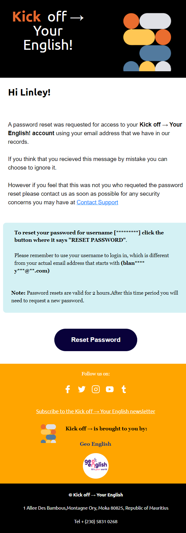
Password Reset Notification Email Design 5

  • The purpose of the password reset notification email design is to guide customers through the process of resetting their password securely. The email should provide clear instructions, ensure security, and offer support for any issues that may arise.
  • The email should:
  • Notify of Password Reset Request:
    • Clearly state that a password reset request was made for the customer’s account.
    • Include the time and date of the request for security purposes.
  • Provide Reset Instructions:
    • Offer a direct link or button to reset the password.
    • Clearly state the link’s expiration time to ensure prompt action.
  • Ensure Security:
    • Reassure the customer that if they did not request the reset, no changes will be made to their account.
    • Encourage them to contact support if they did not initiate the request.
  • Include a Clear Call-to-Action:
    • Use a prominent call-to-action, such as “Reset Your Password,” to make the next step obvious.
    • Ensure the call-to-action stands out visually within the email.
  • Provide Support Information:
    • Offer contact information for customer support in case they encounter issues.
    • Include links to relevant FAQs or help center articles.
  • Ensure Visual Appeal:
    • Design the email to be visually appealing, mobile-friendly, and consistent with the brand’s identity.
    • Use a clean layout, engaging visuals, and clear language to ensure the message is easy to understand.
  • Guarantee Responsive Design:
    • Ensure the email displays correctly on both mobile and desktop devices.
    • Test the email across various browsers, operating systems, and email clients to ensure consistent performance and a seamless user experience.

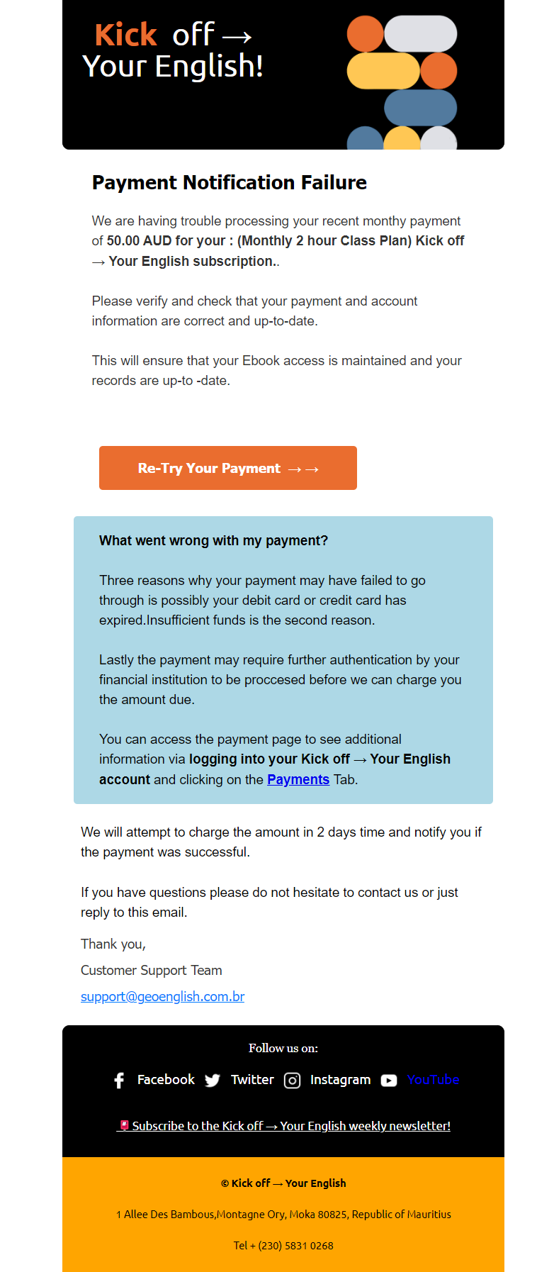
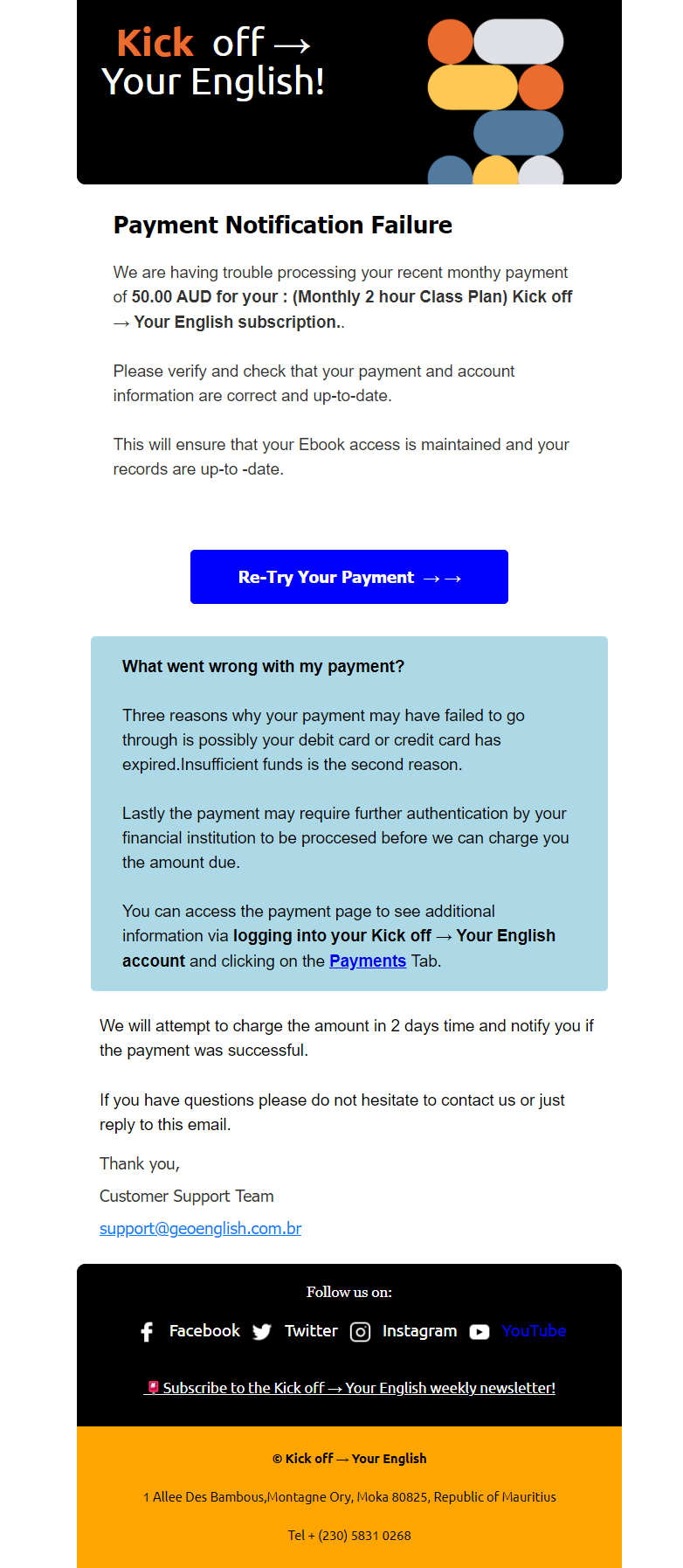
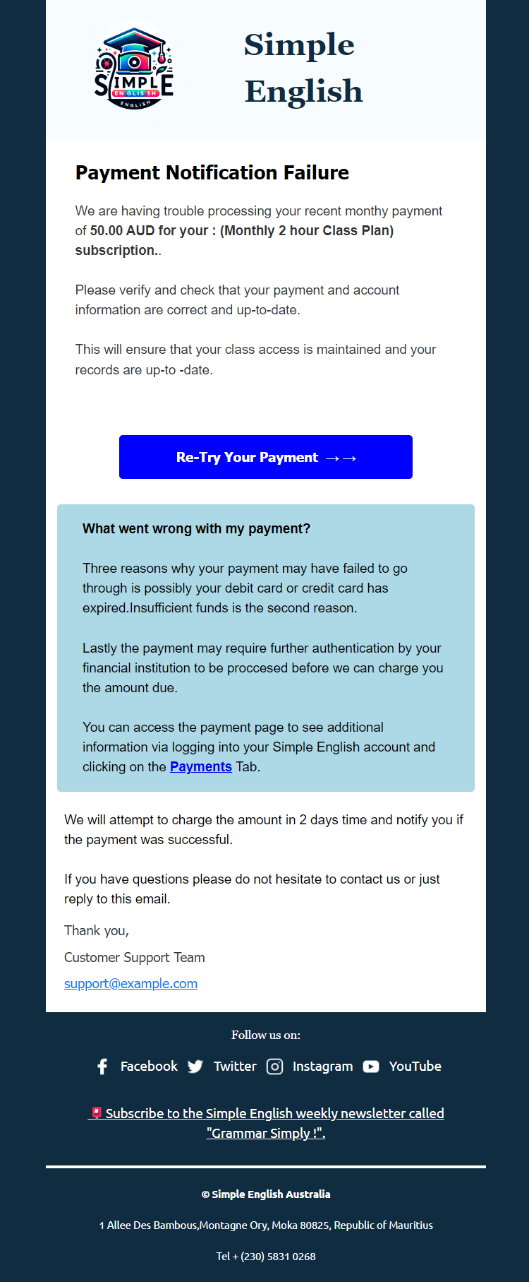
Payment Notification Failure Email Design 8

  • The purpose of the payment notification failure email design is to alert customers about an issue with their recent payment attempt. The email should provide clear details about the failed transaction, offer solutions to resolve the issue and ensure the customer can easily take action to rectify the situation.
  • The email should:
  • Notify of Payment Failure:
    • Clearly state that the recent payment attempt was unsuccessful.
    • Include the date and amount of the failed transaction.
  • Explain the Issue:
    • Provide a brief explanation of why the payment may have failed (e.g., insufficient funds, incorrect payment details, expired card).
    • Emphasize the importance of resolving the issue promptly to avoid service interruptions.
  • Offer Solutions:
    • Suggest steps the customer can take to resolve the issue, such as updating payment information, using an alternate payment method, or contacting their bank.
    • Include a direct link or button to the payment update page.
  • Include a Clear Call-to-Action:
    • Use a compelling call-to-action, such as “Update Payment Information,” “Retry Payment,” or “Contact Support.”
    • Ensure the call-to-action stands out visually within the email.
  • Provide Support Information:
    • Offer contact information for customer support.
    • Include links to FAQs or help centre articles related to payment issues.
  • Ensure Visual Appeal:
    • Design the email to be visually appealing, mobile-friendly, and consistent with the brand’s identity.
    • Use a clean layout, engaging visuals, and clear language to ensure the message is easy to understand.
  • Guarantee Responsive Design:
    • Ensure the email renders correctly on both mobile and desktop devices.
    • Test the email across various browsers, operating systems, and email clients to ensure consistent performance and a seamless user experience.
  • 4o

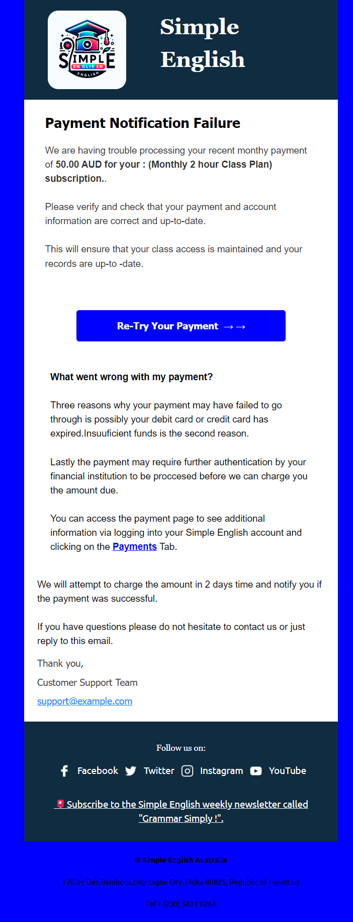
Payment Notification Failure Email Design 7

  • The purpose of the payment notification failure email design is to alert customers about an issue with their recent payment attempt. The email should provide clear details about the failed transaction, offer solutions to resolve the issue and ensure the customer can easily take action to rectify the situation.
  • The email should:
  • Notify of Payment Failure:
    • Clearly state that the recent payment attempt was unsuccessful.
    • Include the date and amount of the failed transaction.
  • Explain the Issue:
    • Provide a brief explanation of why the payment may have failed (e.g., insufficient funds, incorrect payment details, expired card).
    • Emphasize the importance of resolving the issue promptly to avoid service interruptions.
  • Offer Solutions:
    • Suggest steps the customer can take to resolve the issue, such as updating payment information, using an alternate payment method, or contacting their bank.
    • Include a direct link or button to the payment update page.
  • Include a Clear Call-to-Action:
    • Use a compelling call-to-action, such as “Update Payment Information,” “Retry Payment,” or “Contact Support.”
    • Ensure the call-to-action stands out visually within the email.
  • Provide Support Information:
    • Offer contact information for customer support.
    • Include links to FAQs or help center articles related to payment issues.
  • Ensure Visual Appeal:
    • Design the email to be visually appealing, mobile-friendly, and consistent with the brand’s identity.
    • Use a clean layout, engaging visuals, and clear language to ensure the message is easy to understand.
  • Guarantee Responsive Design:
    • Ensure the email renders correctly on both mobile and desktop devices.
    • Test the email across various browsers, operating systems, and email clients to ensure consistent performance and a seamless user experience.

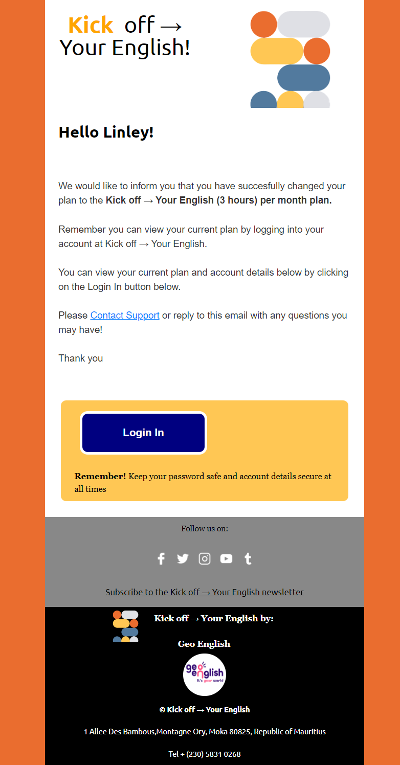
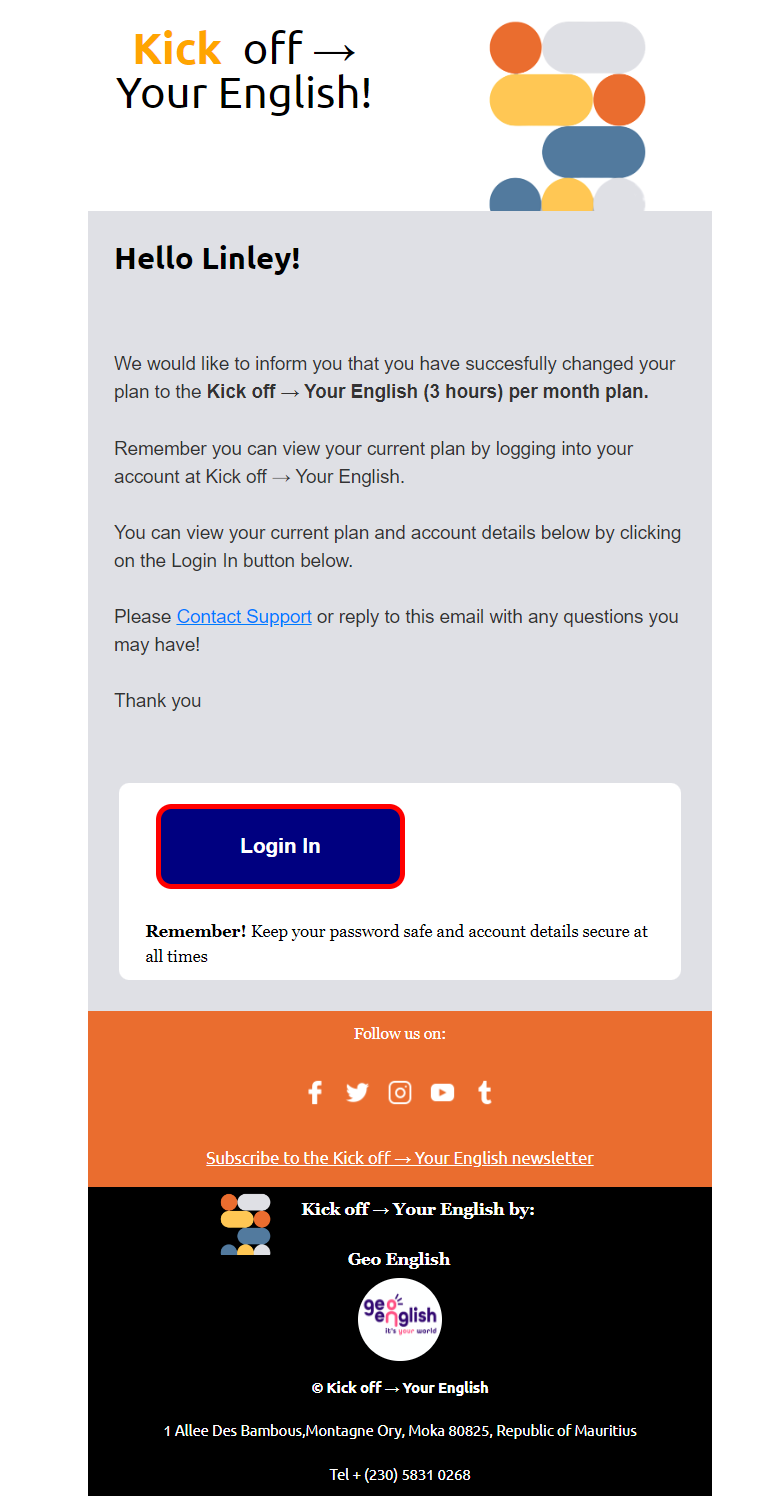
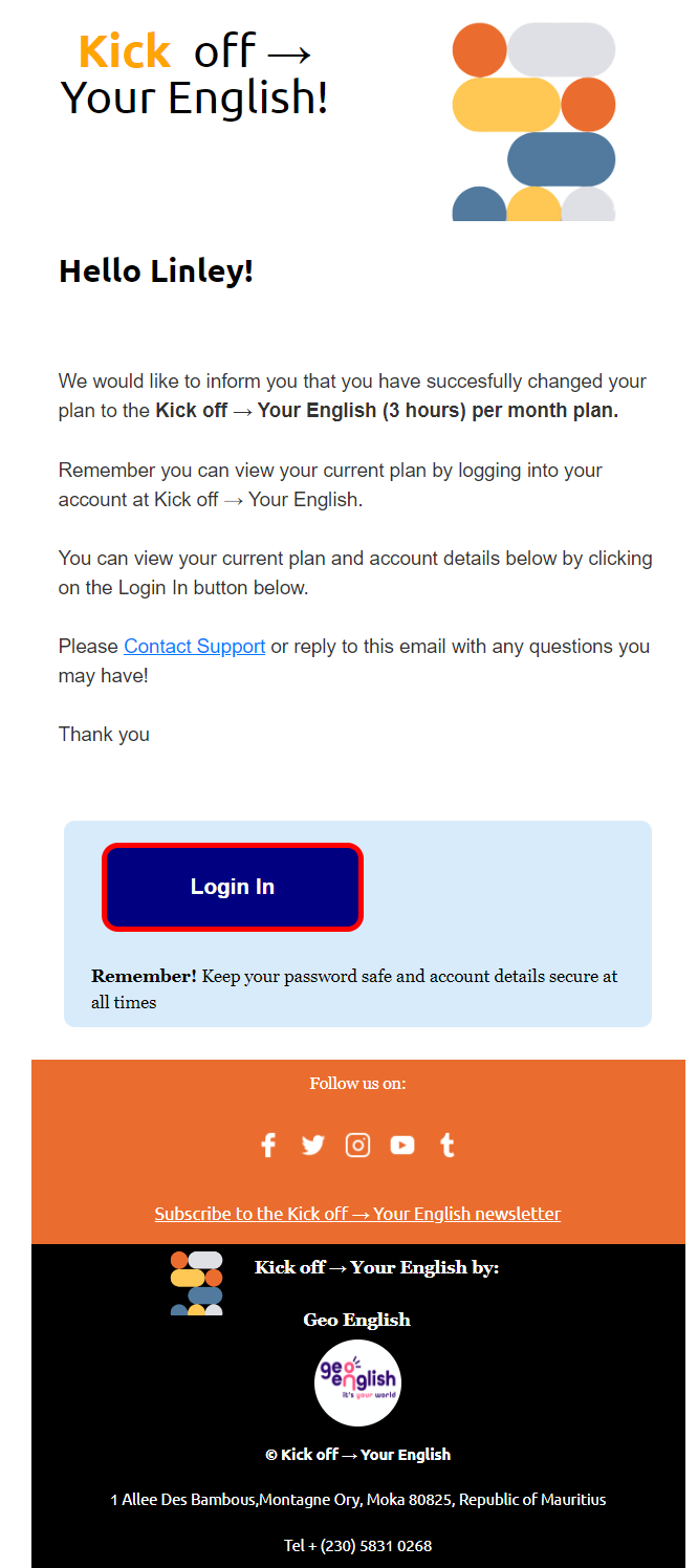
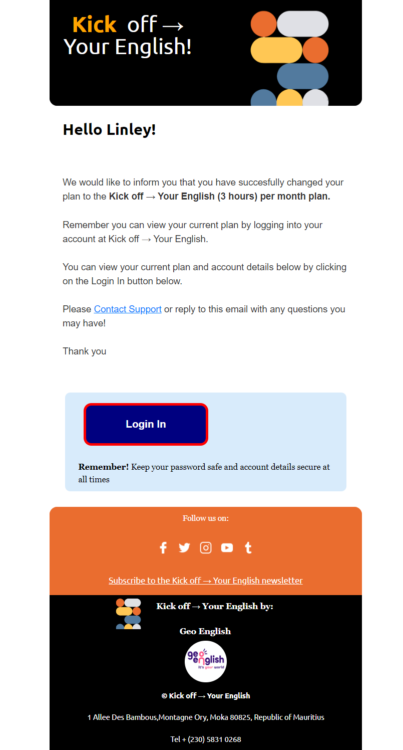
Change of Plan Notification Email Design 7

  • The purpose of the change of plan notification email design is to inform customers about updates to their subscription or service plan. The email should clearly detail the changes, explain the benefits, and provide support for any questions or concerns.
  • The email should:
  • Announce the Plan Change:
    • Clearly communicate the change in the subscription or service plan.
    • Specify the effective date of the change.
  • Detail the Changes:
    • Provide a thorough explanation of the new plan, highlighting key differences from the previous plan.
    • Emphasize any additional benefits or enhancements in the new plan.
  • Reassure the Customer:
    • Address potential concerns the customer may have.
    • Reassure them of the ongoing value and quality of the service.
  • Include a Clear Call-to-Action:
    • Offer a clear call-to-action, such as “Review Your New Plan,” “Manage Your Subscription,” or “Contact Us for More Information.”
    • Link directly to the account management page or customer support.
  • Provide Support:
    • Include contact information for customer support.
    • Link to FAQs or help centre articles related to the plan change.
  • Ensure Visual Appeal:
    • Design the email to be visually appealing, mobile-friendly, and consistent with the brand’s identity.
    • Use a clean layout, engaging visuals, and clear language to ensure the message is easy to understand.
  • Guarantee Responsive Design:
    • Ensure the email displays correctly on both mobile and desktop devices.
    • Test the email across various browsers, operating systems, and email clients to ensure consistent performance and a seamless user experience.
  • 4o
  • ChatGPT can mak

Change of Plan Notification Email Design 6

  • The purpose of the change of plan notification email design is to inform customers about updates to their subscription or service plan. The email should detail the changes, explain the benefits, and provide support for any questions or concerns.
  • The email should:
  • Announce the Pla 6n Change:
    • Clearly communicate the change in the subscription or service plan.
    • Specify the effective date of the change.
  • Detail the Changes:
    • Provide a thorough explanation of the new plan, highlighting key differences from the previous plan.
    • Emphasize any additional benefits or enhancements in the new plan.
  • Reassure the Customer:
    • Address potential concerns the customer may have.
    • Reassure them of the ongoing value and quality of the service.
  • Include a Clear Call-to-Action:
    • Offer a clear call-to-action, such as “Review Your New Plan,” “Manage Your Subscription,” or “Contact Us for More Information.”
    • Link directly to the account management page or customer support.
  • Provide Support:
    • Include contact information for customer support.
    • Link to FAQs or help centre articles related to the plan change.
  • Ensure Visual Appeal:
    • Design the email to be visually appealing, mobile-friendly, and consistent with the brand’s identity.
    • Use a clean layout, engaging visuals, and clear language to ensure the message is easy to understand.
  • Guarantee Responsive Design:
    • Ensure the email displays correctly on both mobile and desktop devices.
    • Test the email across various browsers, operating systems, and email clients to ensure consistent performance and a seamless user experience.
  • 4o

Change of Plan Notification Email Design 5

  • The purpose of the change of plan notification email design is to inform customers about updates to their subscription or service plan. The email should clearly detail the changes, explain the benefits, and provide support for any questions or concerns.
  • The email should:
  • Announce the Plan Change:
    • Communicate the change in the subscription or service plan.
    • Specify the effective date of the change.
  • Detail the Changes:
    • Provide a thorough explanation of the new plan, highlighting key differences from the previous plan.
    • Emphasize any additional benefits or enhancements in the new plan.
  • Reassure the Customer:
    • Address potential concerns the customer may have.
    • Reassure them of the ongoing value and quality of the service.
  • Include a Clear Call-to-Action:
    • Offer a clear call-to-action, such as “Review Your New Plan,” “Manage Your Subscription,” or “Contact Us for More Information.”
    • Link directly to the account management page or customer support.
  • Provide Support:
    • Include contact information for customer support.
    • Link to FAQs or help centre articles related to the plan change.
  • Ensure Visual Appeal:
    • Design the email to be visually appealing, mobile-friendly, and consistent with the brand’s identity.
    • Use a clean layout, engaging visuals, and clear language to ensure the message is easy to understand.
  • Guarantee Responsive Design:
    • Ensure the email displays correctly on both mobile and desktop devices.
    • Test the email across various browsers, operating systems, and email clients to ensure consistent performance and a seamless user experience.

Change of Plan Notification Email Design 4

  • The purpose of the change of plan notification email design is to inform customers about modifications to their subscription or service plan. The email should provide clear details of the changes, explain the benefits, and offer support for any questions or concerns.
  • The email should:
  • Notify of Plan Change:
    • Clearly state the change in the subscription or service plan.
    • Include the effective date of the change.
  • Explain the Changes:
    • Provide a detailed explanation of the new plan, highlighting the differences from the previous plan.
    • Emphasize any added benefits or improvements in the new plan.
  • Reassure the Customer:
    • Address any potential concerns the customer may have.
    • Reassure them of the continued value and quality of the service.
  • Include a Clear Call-to-Action:
    • Provide a call-to-action, such as “Review Your New Plan,” “Manage Your Subscription,” or “Contact Us for More Information.”
    • Link directly to the account management page or customer support.
  • Offer Support:
    • Provide contact information for customer support.
    • Include links to FAQs or help centre articles related to the plan change.
  • Ensure Visual Appeal:
    • Design the email to be visually appealing, mobile-friendly, and consistent with the brand’s identity.
    • Use a clean layout, engaging visuals, and straightforward language to ensure the message is easy to understand.
  • Guarantee Responsive Design:
    • Ensure the email renders correctly on both mobile and desktop devices.
    • Test the email across various browsers, operating systems, and email clients to ensure consistent performance and a seamless user experience.
  • 4o

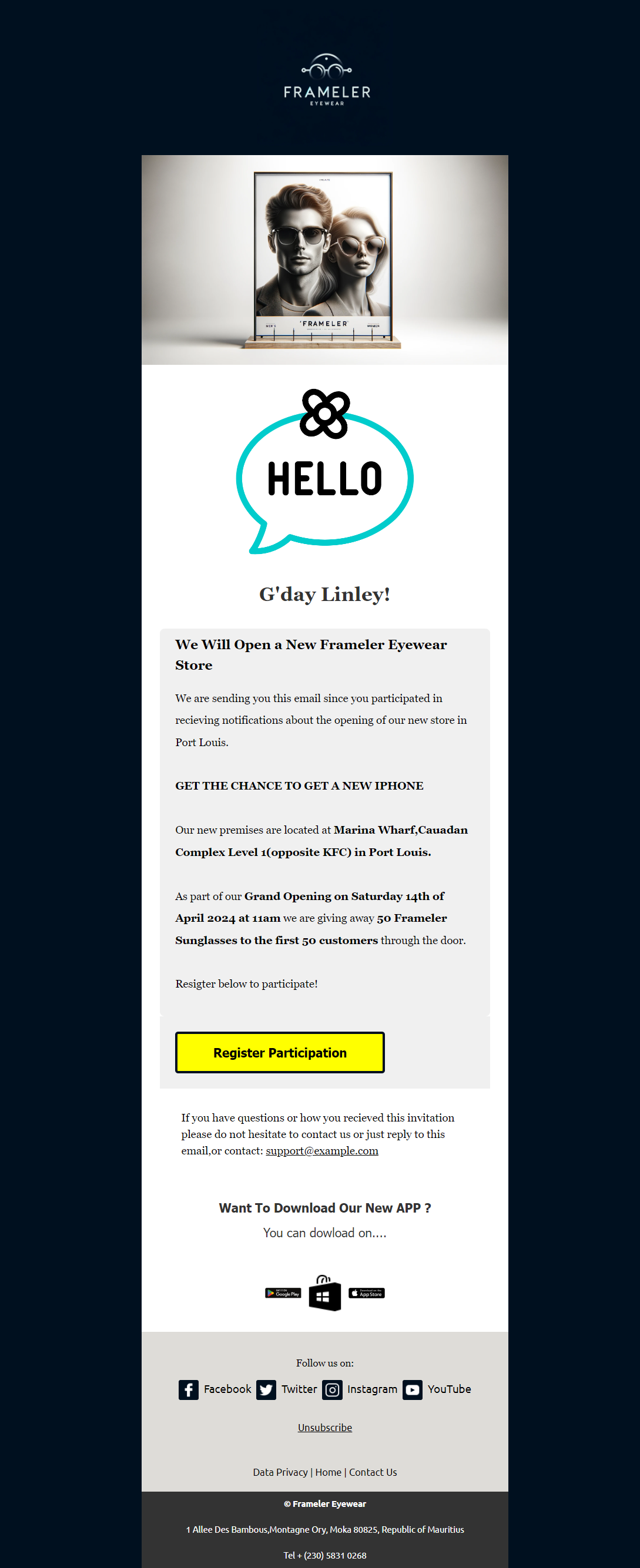
New Store Opening Promo Email Design 2

  • The purpose of the new store opening promo email design is to inform and excite potential customers about the grand opening of a new store. The email should highlight key details about the store, special opening offers, and create a sense of anticipation to encourage visits.
  • The email should:
  • Announce the New Store Opening:
    • Clearly introduce the new store and its location.
    • Generate excitement about the grand opening event.
  • Highlight Key Details:
    • Include the opening date, store hours, and special features of the new location.
    • Emphasize any unique aspects or exclusive products available at the new store.
  • Detail Special Opening Offers:
    • Provide information on any opening day discounts, giveaways, or limited-time promotions.
    • Highlight the value and savings these offers provide.
  • Include a Clear Call-to-Action:
    • Use a compelling call-to-action, such as “Join Us,” “Mark Your Calendar,” or “Visit Our New Store.”
    • Link directly to a map, RSVP page, or promotional landing page.
  • Provide Essential Information:
    • Offer key details about the new store, including contact information and parking or public transport options.
    • Include any health and safety measures in place for the event.
  • Ensure Visual Appeal:
    • Design the email to be visually appealing, mobile-friendly, and consistent with the brand’s identity.
    • Use high-quality images of the new store, engaging layout, and persuasive copy to create a positive and motivating experience.
  • Guarantee Responsive Design:
    • Ensure the email renders correctly on both mobile and desktop devices.
    • Test the email across various browsers, operating systems, and email clients to ensure consistent performance and a seamless user experience.
  • 4o

New Store Opening Promo Email Design

  • The purpose of the new store opening promo email design is to inform and excite potential customers about the grand opening of a new store. The email should highlight key details about the store, and special opening offers, and create a sense of anticipation to encourage visits.
  • The email should:
  • Announce the New Store Opening:
    • Clearly introduce the new store and its location.
    • Generate excitement about the grand opening event.
  • Highlight Key Details:
    • Include the opening date, store hours, and special features of the new location.
    • Emphasize any unique aspects or exclusive products available at the new store.
  • Detail Special Opening Offers:
    • Provide information on any opening day discounts, giveaways, or limited-time promotions.
    • Highlight the value and savings these offers provide.
  • Include a Clear Call-to-Action:
    • Use a compelling call-to-action, such as “Join Us,” “Mark Your Calendar,” or “Visit Our New Store.”
    • Link directly to a map, RSVP page, or promotional landing page.
  • Provide Essential Information:
    • Offer key details about the new store, including contact information and parking or public transport options.
    • Include any health and safety measures in place for the event.
  • Ensure Visual Appeal:
    • Design the email to be visually appealing, mobile-friendly, and consistent with the brand’s identity.
    • Use high-quality images of the new store, engaging layout, and persuasive copy to create a positive and motivating experience.
  • Guarantee Responsive Design:
    • Ensure the email renders correctly on both mobile and desktop devices.
    • Test the email across various browsers, operating systems, and email clients to ensure consistent performance and a seamless user experience.
  • 4o

Account Set-up Invitation Notification Email Design 5

  • The purpose of the account set-up invitation notification email design is to guide new users through the process of setting up their accounts, ensuring they have all the necessary information and instructions to get started smoothly. The email should be welcoming, clear, and motivating.
  • The email should:
  • Welcome the New User:
    • Warmly welcome the new user to the platform or service.
    • Express excitement about having them on board.
  • Provide Account Set-Up Instructions:
    • Offer clear and concise steps for setting up their account.
    • Include a direct link or button to the account set-up page.
  • Highlight Key Benefits:
    • Emphasize the advantages of having an account, such as personalized features, exclusive content, or enhanced user experience.
    • Include testimonials or success stories from other users to build credibility.
  • Include a Clear Call-to-Action:
    • Use a compelling call-to-action, such as “Set Up Your Account Now,” “Get Started,” or “Complete Your Registration.”
    • Ensure the call-to-action stands out visually within the email.
  • Provide Support and Resources:
    • Offer contact information for customer support in case the user encounters any issues during the set-up process.
    • Include links to relevant resources such as FAQs or help centre articles.
  • Ensure Visual Appeal:
    • Design the email to be visually appealing, mobile-friendly, and consistent with the brand’s identity.
    • Use a clean layout, engaging visuals, and straightforward language to ensure the message is easy to understand.
  • Guarantee Responsive Design:
    • Ensure the email renders correctly on both mobile and desktop devices.
    • Test the email across various browsers, operating systems, and email clients to ensure consistent performance and a seamless user experience.
  • 4o
  • ChatGPT can ma

Travel Destination Travel Agency Promo Email Design 3

  • The purpose of the travel destination promo email design is to captivate potential travellers by showcasing exciting travel destinations and encouraging them to book their next trip. The email should provide stunning visuals, key destination highlights, and special offers to inspire action.
  • The email should:
  • Introduce the Travel Destinations:
    • Clearly present the featured travel destinations.
    • Generate excitement about the unique experiences each destination offers.
  • Highlight Key Attractions:
    • Emphasize the top attractions and activities available at each destination.
    • Include testimonials or reviews from travellers who have visited these destinations.
  • Detail Special Offers:
    • Provide information on any discounts, limited-time deals, or exclusive packages.
    • Highlight the value and savings these offers provide.
  • Include a Clear Call-to-Action:
    • Use a compelling call-to-action, such as “Book Now,” “Discover More,” or “Plan Your Trip.”
    • Link directly to the booking page, destination details, or promotional landing page.
  • Provide Essential Information:
    • Offer key details about the travel packages, including dates, accommodations, and itineraries.
    • Include information about any travel requirements or recommendations.
  • Ensure Visual Appeal:
    • Design the email to be visually appealing, mobile-friendly, and consistent with the brand’s identity.
    • Use high-quality images, engaging layouts, and persuasive copy to create a positive and inspiring experience.
  • Guarantee Responsive Design:
    • Ensure the email renders correctly on both mobile and desktop devices.
    • Test the email across various browsers, operating systems, and email clients to ensure consistent performance and a seamless user experience.

Online English Classes Promo Email Design 5

  • The purpose of the online English class promo email design is to attract and engage potential students by showcasing the advantages of enrolling in online English courses. The email should provide compelling details and special offers, and prompt recipients to take action.
  • The email should:
  • Introduce the Online Classes:
    • Clearly present the opportunity to enrol in online English classes.
    • Generate excitement about the convenience and effectiveness of learning English online.
  • Highlight Key Benefits:
    • Emphasize the unique aspects of online English classes, such as live interactive sessions, personalized lesson plans, and access to a wide range of learning materials.
    • Include testimonials or success stories from current or former students to build credibility.
  • Detail Special Offers:
    • Provide information on any discounts, free trial lessons, or limited-time offers.
    • Emphasize the value and savings these offers provide.
  • Include a Clear Call-to-Action:
    • Provide a strong call-to-action, such as “Enroll Now,” “Claim Your Free Trial,” or “Start Learning Today.”
    • Link directly to the enrollment page, registration form, or promotional landing page.
  • Provide Essential Information:
    • Offer key details about the classes, including course schedules, levels, and instructors.
    • Include information about the platform used for online classes and any technical requirements.
  • Ensure Visual Appeal:
    • Design the email to be visually appealing, mobile-friendly, and consistent with the brand’s identity.
    • Use high-quality images, an engaging layout, and persuasive copy to create a positive and motivating experience.
  • Guarantee Responsive Design:
    • Ensure the email renders correctly on both mobile and desktop devices.
    • Test the email across various browsers, operating systems, and email clients to ensure consistent performance and a seamless user experience.
  • 4o

Online English Classes Promo Email Design 5

  • The purpose of the online English classes promo email design is to attract and motivate potential students to enroll in the offered courses. The email should clearly outline the benefits, provide special offers, and prompt immediate action.
  • The email should:
  • Introduce the Online Classes:
    • Clearly announce the availability of online English classes.
    • Generate excitement about the convenience and effectiveness of learning English online.
  • Highlight Key Benefits:
    • Emphasize unique features such as live interactive sessions, personalized lesson plans, and access to a wide range of learning materials.
    • Include testimonials or success stories from current or former students to build credibility and trust.
  • Detail Special Offers:
    • Provide information on any discounts, free trial lessons, or limited-time offers.
    • Highlight the value and savings these offers provide to make the deal more enticing.
  • Include a Clear Call-to-Action:
    • Use a compelling call-to-action, such as “Enroll Now,” “Claim Your Free Trial,” or “Start Learning Today.”
    • Link directly to the enrollment page, registration form, or promotional landing page.
  • Provide Essential Information:
    • Offer key details about the classes, including course schedules, levels, and instructor qualifications.
    • Include information about the platform used for online classes and any technical requirements.
  • Ensure Visual Appeal:
    • Design the email to be visually appealing, mobile-friendly, and consistent with the brand’s identity.
    • Use high-quality images, engaging layout, and persuasive copy to create a positive and motivating experience.
  • Guarantee Responsive Design:
    • Ensure the email renders correctly on both mobile and desktop devices.
    • Test the email across various browsers, operating systems, and email clients to ensure consistent performance and a seamless user experience.
  • 4o

Ebook Download Notification Email Design 3

  • The purpose of the eBook download notification email design is to inform the user that their eBook is ready for download and provide them with the necessary steps to access it. The email should ensure clarity, provide essential information, and offer a seamless user experience.
  • The email should:
  • Acknowledge the Request:
    • Clearly state that the eBook is ready for download.
    • Include relevant details such as the title of the eBook and the date of the request.
  • Provide Download Instructions:
    • Offer a direct link or button for the user to download the eBook.
    • Ensure the link is prominent and easy to find within the email.
  • Highlight Key Features:
    • Emphasize the benefits and key features of the eBook, such as valuable insights, practical tips, or exclusive content.
  • Include a Strong Call-to-Action:
    • Use a compelling call-to-action, such as “Download Your eBook,” “Access Now,” or “Get Your Copy.”
    • Ensure the call-to-action stands out visually within the email.
  • Offer Support and Resources:
    • Provide contact information for customer support in case the user encounters any issues with the download.
    • Include links to relevant resources such as FAQs or help center articles.
  • Ensure Visual Appeal:
    • Design the email to be visually clear, professional, and consistent with the brand’s identity.
    • Use a clean layout and straightforward language to ensure the message is easy to understand.
  • Guarantee Responsive Design:
    • Ensure the email renders correctly on both mobile and desktop devices.
    • Test the email across various browsers, operating systems, and email clients to ensure consistent performance and a seamless user experience.
  • 4o

Online English Classes Promo Email Design

The purpose of the online English classes promo email design is to attract and engage potential students by showcasing the advantages of enrolling in online English courses. The email should provide compelling details, and special offers, and prompt recipients to take action.

The email should:

  1. Introduce the Online Classes:
    • Clearly present the opportunity to enrol in online English classes.
    • Generate excitement about the convenience and effectiveness of learning English online.
  2. Highlight Key Benefits:
    • Emphasize the unique aspects of online English classes, such as live interactive sessions, personalized lesson plans, and access to a wide range of learning materials.
    • Include testimonials or success stories from current or former students to build credibility.
  3. Detail Special Offers:
    • Provide information on any discounts, free trial lessons, or limited-time offers.
    • Emphasize the value and savings these offers provide.
  4. Include a Clear Call-to-Action:
    • Provide a strong call-to-action, such as “Enroll Now,” “Claim Your Free Trial,” or “Start Learning Today.”
    • Link directly to the enrollment page, registration form, or promotional landing page.
  5. Provide Essential Information:
    • Offer key details about the classes, including course schedules, levels, and instructors.
    • Include information about the platform used for online classes and any technical requirements.
  6. Ensure Visual Appeal:
    • Design the email to be visually appealing, mobile-friendly, and consistent with the brand’s identity.
    • Use high-quality images, an engaging layout, and persuasive copy to create a positive and motivating experience.
  7. Guarantee Responsive Design:
    • Ensure the email renders correctly on both mobile and desktop devices.
    • Test the email across various browsers, operating systems, and email clients to ensure consistent performance and a seamless user experience.

4o

Two-factor Authentication (2FA) Notification Email Design

  • The purpose of the two-factor authentication (2FA) notification email design is to inform the user about a 2FA request and provide them with the necessary details to complete the authentication process. The email should ensure clarity, security, and ease of use.
  • The email should:
  • Acknowledge the 2FA Request:
    • Clearly state that a 2FA request has been made for the user’s account.
    • Include the date, time, and device or location of the request to provide context.
  • Provide Authentication Instructions:
    • Offer clear instructions on how to complete the 2FA process.
    • Include any necessary codes or links required for authentication.
  • Emphasize Security:
    • Reassure the user that this process is a standard security measure to protect their account.
    • Advise the user to contact support if they did not initiate the request.
  • Include a Strong Call-to-Action:
    • Use a compelling call-to-action, such as “Complete Authentication,” “Verify Now,” or “Secure Your Account.”
    • Ensure the call-to-action stands out visually within the email.
  • Offer Support and Resources:
    • Provide contact information for customer support in case the user encounters any issues.
    • Include links to relevant resources such as FAQs or help center articles.
  • Ensure Visual Appeal:
    • Design the email to be visually clear, professional, and consistent with the brand’s identity.
    • Use a clean layout and straightforward language to ensure the message is easy to understand.
  • Guarantee Responsive Design:
    • Ensure the email renders correctly on both mobile and desktop devices.
    • Test the email across various browsers, operating systems, and email clients to ensure consistent performance and a seamless user experience.
  • 4o

Payment Failure Notification Email Design 5

  • The purpose of the payment notification failure email design is to inform the user about an issue with their recent payment and provide guidance on how to resolve it. The email should clearly communicate the problem, offer steps to fix it, and ensure a secure and reassuring experience.
  • The email should:
  • Acknowledge the Issue:
    • Clearly state that there was a failure in processing the recent payment.
    • Include relevant details such as the transaction date, amount, and order number to provide context.
  • Explain the Problem:
    • Provide a brief explanation of why the payment failed, such as insufficient funds, incorrect payment information, or technical issues.
  • Offer Steps to Resolve:
    • Provide clear instructions on what the user needs to do to resolve the payment issue.
    • Include a link or button to update payment information, retry the payment, or contact support.
  • Include a Strong Call-to-Action:
    • Use a compelling call-to-action, such as “Update Payment Method,” “Retry Payment,” or “Contact Support.”
    • Ensure the call-to-action stands out visually within the email.
  • Reassure the User:
    • Reassure the user that their account and personal information are secure.
    • Mention that resolving the payment issue promptly will help avoid any disruptions in service.
  • Offer Support and Resources:
    • Provide contact information for customer support in case the user needs assistance.
    • Include links to relevant resources such as FAQs or help center articles.
  • Ensure Visual Appeal:
    • Design the email to be visually clear, professional, and consistent with the brand’s identity.
    • Use a clean layout and straightforward language to ensure the message is easy to understand.
  • Guarantee Responsive Design:
    • Ensure the email renders correctly on both mobile and desktop devices.
    • Test the email across various browsers, operating systems, and email clients to ensure consistent performance and a seamless user experience.
  • 4o

Payment Notification Failure Email Design 4

  • The purpose of the payment notification failure email design is to inform the user about an issue with their recent payment and provide guidance on how to resolve it. The email should clearly communicate the problem, offer steps to fix it, and ensure a secure and reassuring experience.
  • The email should:
  • Acknowledge the Issue:
    • Clearly state that there was a failure in processing the recent payment.
    • Include relevant details such as the transaction date, amount, and order number to provide context.
  • Explain the Problem:
    • Provide a brief explanation of why the payment failed, such as insufficient funds, incorrect payment information, or technical issues.
  • Offer Steps to Resolve:
    • Provide clear instructions on what the user needs to do to resolve the payment issue.
    • Include a link or button to update payment information, retry the payment, or contact support.
  • Include a Strong Call-to-Action:
    • Use a compelling call-to-action, such as “Update Payment Method,” “Retry Payment,” or “Contact Support.”
    • Ensure the call-to-action stands out visually within the email.
  • Reassure the User:
    • Reassure the user that their account and personal information are secure.
    • Mention that resolving the payment issue promptly will help avoid any disruptions in service.
  • Offer Support and Resources:
    • Provide contact information for customer support in case the user needs assistance.
    • Include links to relevant resources such as FAQs or help center articles.
  • Ensure Visual Appeal:
    • Design the email to be visually clear, professional, and consistent with the brand’s identity.
    • Use a clean layout and straightforward language to ensure the message is easy to understand.
  • Guarantee Responsive Design:
    • Ensure the email renders correctly on both mobile and desktop devices.
    • Test the email across various browsers, operating systems, and email clients to ensure consistent performance and a seamless user experience.
  • 4o

Reset Password Notification Email Design

  • The purpose of the reset password notification email design is to inform the user about a password reset request and provide them with the necessary steps to securely reset their password. The email should ensure clarity, security, and ease of use.
  • The email should:
  • Acknowledge the Request:
    • Clearly state that a password reset request has been made for the user’s account.
    • Include the date and time of the request to provide context.
  • Provide Reset Instructions:
    • Offer a direct link or button for the user to reset their password.
    • Ensure the link is prominent and easy to find within the email.
  • Emphasize Security:
    • Reassure the user that their account is secure and that the email is a standard security measure.
    • Mention that the link is time-sensitive and should not be shared with anyone.
  • Include a Strong Call-to-Action:
    • Use a compelling call-to-action, such as “Reset Password,” “Change Your Password,” or “Secure Your Account.”
    • Ensure the call-to-action stands out visually within the email.
  • Offer Support and Resources:
    • Provide contact information for customer support in case the user did not request the password reset or needs assistance.
    • Include a brief note on what to do if the user encounters any issues.
  • Ensure Visual Appeal:
    • Design the email to be visually clear, professional, and consistent with the brand’s identity.
    • Use a clean layout and straightforward language to ensure the message is easy to understand.
  • Guarantee Responsive Design:
    • Ensure the email renders correctly on both mobile and desktop devices.
    • Test the email across various browsers, operating systems, and email clients to ensure consistent performance and a seamless user experience.
  • 4o

Account Sign-Up Invitation Notification Email Design 3

  • The purpose of the account sign-up invitation notification email design is to invite and encourage potential users to create an account, highlighting the benefits and providing clear instructions to complete the registration process.
  • The email should:
  • Extend the Invitation:
    • Invite the recipient to sign up and create an account.
    • Create a welcoming and enthusiastic tone to encourage engagement.
  • Highlight Key Benefits:
    • Emphasize the advantages of having an account, such as access to exclusive content, personalized recommendations, and special offers.
    • Include testimonials or reviews from existing users to build credibility.
  • Provide Clear Instructions:
    • Offer step-by-step guidance on how to sign up and create an account.
    • Include a direct link or button to the sign-up page, making the process as seamless as possible.
  • Include a Strong Call-to-Action:
    • Use a compelling call-to-action, such as “Create Your Account,” “Join Now,” or “Get Started.”
    • Ensure the call-to-action stands out visually within the email.
  • Offer Support and Resources:
    • Provide links to additional resources, such as FAQs or a help center, to assist with any questions or issues during the sign-up process.
    • Include contact information for customer support for personalized assistance.
  • Ensure Visual Appeal:
    • Design the email to be visually attractive, mobile-friendly, and consistent with the brand’s identity.
    • Use an engaging layout, high-quality images, and persuasive copy to create a positive and inviting experience.
  • Guarantee Responsive Design:
    • Ensure the email renders correctly on both mobile and desktop devices.
    • Test the email across various browsers, operating systems, and email clients to ensure consistent performance and a seamless user experience.
  • 4o

Online English Class Promo Email Design 3

  • The purpose of the online English class promo email design is to attract and engage potential students by highlighting the advantages of enrolling in online English courses. The email should provide compelling details, and special offers, and prompt recipients to take action.
  • The email should:
  • Introduce the Online Classes:
    • Clearly present the opportunity to enroll in online English classes.
    • Generate excitement about the convenience and effectiveness of learning English online.
  • Highlight Key Benefits:
    • Emphasize the unique aspects of the online English classes, such as live interactive sessions, personalized lesson plans, and access to a wide range of learning materials.
    • Include testimonials or success stories from current or former students to build credibility.
  • Detail Special Offers:
    • Provide information on any discounts, free trial lessons, or limited-time offers.
    • Emphasize the value and savings these offers provide.
  • Include a Clear Call-to-Action:
    • Provide a strong call-to-action, such as “Enroll Now,” “Claim Your Free Trial,” or “Start Learning Today.”
    • Link directly to the enrollment page, registration form, or promotional landing page.
  • Provide Essential Information:
    • Offer key details about the classes, including course schedules, levels, and instructors.
    • Include information about the platform used for online classes and any technical requirements.
  • Ensure Visual Appeal:
    • Design the email to be visually appealing, mobile-friendly, and consistent with the brand’s identity.
    • Use high-quality images, an engaging layout, and persuasive copy to create a positive and motivating experience.
  • Guarantee Responsive Design:
    • Ensure the email renders correctly on both mobile and desktop devices.
    • Test the email across various browsers, operating systems, and email clients to ensure consistent performance and a seamless user experience.
  • 4o

Study Overseas Education Promo Email Design

  • The purpose of the study overseas education email design is to inspire and inform potential students about opportunities for studying abroad. The email should highlight the benefits, and key details, and prompt recipients to take action towards applying or learning more.
  • The email should:
  • Introduce the Opportunity:
    • Clearly presents the opportunity to study overseas and its benefits.
    • Create excitement about the potential experiences and educational advantages.
  • Highlight Key Features:
    • Emphasize the unique aspects of studying abroad, such as cultural immersion, language learning, and access to prestigious institutions.
    • Include testimonials or success stories from former students.
  • Provide Detailed Information:
    • Offer essential details such as available programs, countries, institutions, and application deadlines.
    • Include information about scholarships, financial aid, and support services for international students.
  • Include a Compelling Call-to-Action:
    • Provide a clear and strong call-to-action, such as “Apply Now,” “Learn More,” or “Start Your Journey.”
    • Link directly to application forms, detailed program pages, or informational resources.
  • Offer Support and Resources:
    • Provide links to additional resources, such as FAQs, webinars, or virtual tours of campuses.
    • Include contact information for admissions counselors or study abroad advisors for personalized support.
  • Ensure Visual Appeal:
    • Design the email to be visually attractive, mobile-friendly, and consistent with the brand’s identity.
    • Use high-quality images, engaging layout, and compelling copy to create an immersive and appealing experience.
  • Guarantee Responsive Design:

Order Confirmation Download Email Design 2

  • The purpose of the order confirmation download email design is to confirm a customer’s recent purchase and provide them with the necessary information and link to download their purchased item. The email should be clear, reassuring, and guide the customer on how to access their digital product.
  • The email should:
  • Confirm the Order:
    • Clearly state that the order has been successfully processed.
    • Include key order details such as the order number, purchase date, and item(s) purchased.
  • Provide Download Link:
    • Offer a direct link or button for the customer to download their purchased item.
    • Ensure the link is prominent and easy to find within the email.
  • Offer Download Instructions:
    • Provide clear and concise instructions on how to download and access the item.
    • Include any necessary information, such as system requirements or steps for installation.
  • Include Order Summary:
    • Provide a summary of the order, including item names, quantities, and prices.
    • Include any additional details such as shipping information if applicable.
  • Offer Customer Support:
    • Provide contact details or links to customer support in case the customer encounters any issues with the download.
    • Include a brief note on how to get help or report problems.
  • Ensure Security and Trust:
    • Reassure the customer that their payment information and transaction are secure.
    • Include any relevant security badges or certifications.
  • Guarantee Visual Appeal:
    • Design the email to be visually appealing, mobile-friendly, and consistent with the brand’s identity.
    • Use a clean layout, engaging visuals, and clear copy to create a positive and seamless experience.
  • Ensure Responsive Design:
    • Make sure the email renders correctly on both mobile and desktop devices.
    • Test the email across various browsers, operating systems, and email clients to ensure consistent performance and a seamless user experience.
  • 4o

Order Confirmation Download Email Design

  • The order confirmation download email design aims to confirm a customer’s recent purchase and provide them with the necessary information and link to download their purchased item. The email should be clear, and reassuring, and guide the customer on accessing their digital product.
  • The email should:
  • Confirm the Order:
    • Clearly state that the order has been successfully processed.
    • Include key order details such as the order number, purchase date, and item(s) purchased.
  • Provide Download Link:
    • Offer a direct link or button for the customer to download their purchased item.
    • Ensure the link is prominent and easy to find within the email.
  • Offer Download Instructions:
    • Provide clear and concise instructions on how to download and access the item.
    • Include any necessary information, such as system requirements or steps for installation.
  • Include Order Summary:
    • Provide a summary of the order, including item names, quantities, and prices.
    • Include any additional details such as shipping information if applicable.
  • Offer Customer Support:
    • Provide contact details or links to customer support in case the customer encounters any issues with the download.
    • Include a brief note on how to get help or report problems.
  • Ensure Security and Trust:
    • Reassure the customer that their payment information and transactions are secure.
    • Include any relevant security badges or certifications.
  • Guarantee Visual Appeal:
    • Design the email to be visually appealing, mobile-friendly, and consistent with the brand’s identity.
    • Use a clean layout, engaging visuals, and clear copy to create a positive and seamless experience.
  • Ensure Responsive Design:
    • Make sure the email renders correctly on both mobile and desktop devices.
    • Test the email across various browsers, operating systems, and email clients to ensure consistent performance and a seamless user experience.
  • 4o

Espresso Coffee Promotion Email Design 4

  • The goal of the espresso coffee promotion email design is to captivate and motivate potential customers to take advantage of a special offer on espresso coffee products. This email should clearly convey the promotion details, emphasize the product’s benefits, and create a sense of urgency to drive purchases.
  • The email should:
  • Announce the Promotion:
  • Clearly present the details of the promotion.
  • Generate excitement about the special offer on espresso coffee products.
  • Showcase Key Features:
  • Highlight the rich flavor, premium quality, and unique blends of the espresso coffee.
  • Include customer testimonials or reviews to build trust and credibility.
  • Outline Special Offers:
  • Detail any discounts, limited-time deals, or exclusive offers.
  • Emphasize the savings and value provided by the promotion.
  • Include a Compelling Call-to-Action:
  • Provide a clear call-to-action, such as “Buy Now.”
  • Link directly to product pages or a promotional landing page for easy access.
  • Ensure Visual Appeal:
  • Design the email to be visually attractive, mobile-friendly, and aligned with the brand’s identity.
  • Use an engaging layout, high-quality images, and persuasive copy to enhance the overall experience.
  • Guarantee Responsive Design:
  • Ensure the email displays correctly on both mobile and desktop devices.
  • Test the email across various browsers, operating systems, and email clients to ensure a consistent and seamless experience for all users.

Two-Factor Authentication (2FA) Notification Email Design

  • The purpose of the Two-Factor Authentication (2FA) notification email design is to securely inform users about a recent 2FA login attempt and to provide them with the necessary steps to confirm or secure their account. The email should clearly convey the authentication details, ensure the user’s account security, and offer guidance on what to do next.
  • The email should:
  • Confirm Authentication Attempt:
  • Inform the user that a two-factor authentication (2FA) login attempt was made.
  • Specify the date and time of the attempt to provide context.
  • Provide Authentication Details:
  • Include a unique verification code or link used for the 2FA process.
  • Explain briefly how this code or link was used or will be used.
  • Offer Next Steps:
  • Provide clear instructions on what the user should do next, such as entering the code or following the link to complete the authentication.
  • Include a prominent call-to-action button or link, such as “Verify Now” or “Complete Login.”
  • Include Security Reassurances:
  • Reassure the user that their account is secure and that the email is part of a standard security measure.
  • Include a brief note on the importance of keeping their 2FA method secure.
  • Provide Support Information:
  • Offer contact details or links to customer support in case the user did not initiate the 2FA attempt or has any concerns.
  • Include instructions for reporting suspicious activity or recovering the account.
  • Ensure Visual Appeal:
  • Design the email to be visually clear, professional, and consistent with the brand’s identity.
  • Use a clean layout and straightforward language to ensure the message is easy to understand.
  • Guarantee Responsive Design:
  • Ensure the email renders correctly on both mobile and desktop devices.
  • Test the email across various browsers, operating systems, and email clients to ensure consistent performance and a seamless user experience.

Travel Destination Promotion Email Design 2

  • The purpose of the travel destination promotion email design is to captivate and inspire potential travellers by showcasing a specific destination and its unique attractions. The email should entice recipients with compelling details about the destination, highlight special offers, and prompt them to take action.
  • The email should:
  • Highlight the Destination:
    • Introduce the travel destination and its key attractions.
    • Use engaging visuals and captivating descriptions to showcase what makes the destination appealing.
  • Showcase Unique Experiences:
    • Emphasize the unique experiences and activities available at the destination, such as cultural tours, adventure sports, or scenic views.
    • Include testimonials or reviews from travelers who have visited the destination.
  • Detail Special Offers:
    • Provide information on any special deals, discounts, or limited-time offers related to travel packages or bookings.
    • Highlight the value and benefits of these offers to encourage bookings.
  • Include a Clear Call-to-Action:
    • Incorporate a strong call-to-action, such as “Book Your Trip,” “Explore More,” or “Claim Your Offer.”
    • Link directly to a booking page, travel package details, or a promotional landing page.
  • Provide Essential Information:
    • Include important details such as travel dates, package inclusions, and booking deadlines.
    • Offer links to additional resources, such as destination guides or customer support.
  • Ensure Visual Appeal:
    • Design the email to be visually attractive, mobile-friendly, and consistent with the travel brand’s identity.
    • Use high-quality images, engaging layout, and persuasive copy to create an immersive and appealing experience.
  • Guarantee Responsive Design:
    • Ensure the email renders correctly on both mobile and desktop devices.
    • Test the email across various browsers, operating systems, and email clients to ensure a consistent and seamless user experience.
  • 4o mini

Espresso Coffee Promotion 4-Email Design

  • The goal of the espresso coffee promotion email design is to captivate and motivate potential customers to take advantage of a special offer on espresso coffee products. This email should clearly convey the promotion details, emphasize the product’s benefits, and create a sense of urgency to drive purchases.
  • The email should:
  • Announce the Promotion:
  • Clearly present the details of the promotion.
  • Generate excitement about the special offer on espresso coffee products.
  • Showcase Key Features:
  • Highlight the rich flavour, premium quality, and unique blends of the espresso coffee.
  • Include customer testimonials or reviews to build trust and credibility.
  • Outline Special Offers:
  • Detail any discounts, limited-time deals, or exclusive offers.
  • Emphasize the savings and value provided by the promotion.
  • Include a Compelling Call-to-Action:
  • Provide a clear call-to-action, such as “Buy Now.”
  • Link directly to product pages or a promotional landing page for easy access.
  • Ensure Visual Appeal:
  • Design the email to be visually attractive, mobile-friendly, and aligned with the brand’s identity.
  • Use an engaging layout, high-quality images, and persuasive copy to enhance the overall experience.
  • Guarantee Responsive Design:
  • Ensure the email displays correctly on both mobile and desktop devices.
  • Test the email across various browsers, operating systems, and email clients to ensure a consistent and seamless experience for all users.
  • 2/2

Espresso Coffee Promotion 3-Email Design

  • The purpose of the espresso coffee promotion email design is to inform and excite potential customers about a special promotion on espresso coffee products. The email should highlight the key features, and special offers, and create a sense of urgency to encourage purchases.
  • The email should:
  • Introduce the Promotion:
    • Clearly introduce the promotion and its key details.
    • Create excitement about the special offer on espresso coffee.
  • Highlight Key Features:
    • Emphasize the benefits of espresso coffee, such as rich flavour, high quality, and unique blends.
    • Include testimonials or customer reviews if available.
  • Detail Special Offers:
    • Provide details of any discounts, limited-time offers, or exclusive deals.
    • Emphasize the value and savings the promotion offers.
  • Include a Strong Call-to-Action:
    • Provide a clear and compelling call-to-action, such as “Shop Now.”
    • Include links to the product pages or promotional landing page.
  • Ensure Visual Appeal:
    • Make sure the design is visually appealing, mobile-friendly, and consistent with the brand identity.
    • Use an attractive layout, engaging visuals, and persuasive copy to create a positive and engaging experience.
  • Guarantee Responsive Design:
    • Ensure the email renders correctly on both mobile and desktop devices.
    • Test the email across various browsers, operating systems, and email clients to ensure consistent performance and a seamless user experience.
  • 4o

Change Of Plan Notification Email Design 3

  • The purpose of the change of plan notification email design is to inform customers about modifications to their current subscription plan and provide them with relevant details. The email should be clear, and informative, and guide the customer through understanding and accepting the changes.
  • The email should:
  • Inform the Customer:
  • Clearly state that there has been a change to their current subscription plan.
  • Specify the new plan details and how they differ from the current plan.
  • Explain the Changes:
  • Provide a detailed explanation of what changes are being made and why.
  • Highlight any new benefits or features included in the updated plan.
  • Highlight Key Dates:
  • Inform the customer of important dates, such as when the new plan will take effect.
  • Provide a timeline for any actions they might need to take.
  • Provide Instructions:
  • Offer clear instructions on how the customer can review and accept the new plan.
  • Include a prominent call-to-action button or link, such as “Review Your New Plan” or “Accept Changes.”
  • Offer Assistance:
  • Provide support options if the customer has questions or concerns about the new plan.
  • Include contact information or links to customer support for further assistance.
  • Reassure the Customer:
  • Reassure the customer that the change will not disrupt their current service.
  • Emphasize any improvements or added value the new plan provides.
  • Ensure Visual Appeal:
  • Design the email to be visually attractive and aligned with the brand’s identity.
  • Use a clean layout, engaging visuals, and clear copy to create a positive and informative experience.
  • Guarantee Responsive Design:
  • Ensure the email renders correctly on both mobile and desktop devices.
  • Test the email across various browsers, operating systems, and email clients to ensure consistent performance and a seamless user experience